Implementing Effective Navigation
Consistent navigation is an essential component of the overall user experience. Few things frustrate
users more than basic navigation that behaves in inconsistent and unexpected ways. Android 3.0
introduced significant changes to the global navigation behavior. Thoughtfully following the
guidelines for Back and Up will make your app's navigation predictable and reliable for your users.
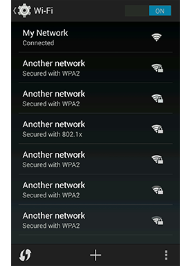
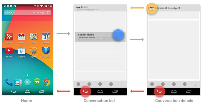
Android 2.3 and earlier relied upon the system
Back button for supporting navigation within an
app. With the introduction of action bars in Android 3.0, a second navigation mechanism appeared:
the
Up button, consisting of the app icon and a left-point caret.

Up vs. Back
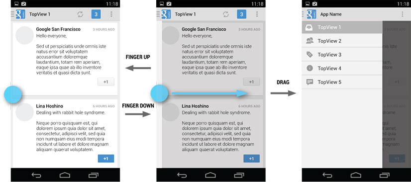
The Up button is used to navigate within an app based on the hierarchical relationships
between screens. For instance, if screen A displays a list of items, and selecting an item leads to
screen B (which presents that item in more detail), then screen B should offer an Up button that
returns to screen A.
If a screen is the topmost one in an app (that is, the app's home), it should not present an Up
button.
The system Back button is used to navigate, in reverse chronological order, through the history
of screens the user has recently worked with. It is generally based on the temporal relationships
between screens, rather than the app's hierarchy.
When the previously viewed screen is also the hierarchical parent of the current screen, pressing
the Back button has the same result as pressing an Up button—this is a common
occurrence. However, unlike the Up button, which ensures the user remains within your app, the Back
button can return the user to the Home screen, or even to a different app.
The Back button also supports a few behaviors not directly tied to screen-to-screen navigation:
- Dismisses floating windows (dialogs, popups)
- Dismisses contextual action bars, and removes the highlight from the selected items
- Hides the onscreen keyboard (IME)
Navigation Within Your App
Navigating to screens with multiple entry points
Sometimes a screen doesn't have a strict position within the app's hierarchy, and can be reached
from multiple entry points—such as a settings screen that can be reached from any other screen
in your app. In this case, the Up button should choose to return to the referring screen, behaving
identically to Back.
Changing view within a screen
Changing view options for a screen does not change the behavior of Up or Back: the screen is still
in the same place within the app's hierarchy, and no new navigation history is created.
Examples of such view changes are:
- Switching views using tabs and/or left-and-right swipes
- Switching views using a dropdown (aka collapsed tabs)
- Filtering a list
- Sorting a list
- Changing display characteristics (such as zooming)
Navigating between sibling screens
When your app supports navigation from a list of items to a detail view of one of those items, it's
often desirable to support direction navigation from that item to another one which precedes or
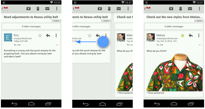
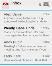
follows it in the list. For example, in Gmail, it's easy to swipe left or right from a conversation
to view a newer or older one in the same Inbox. Just as when changing view within a screen, such
navigation does not change the behavior of Up or Back.
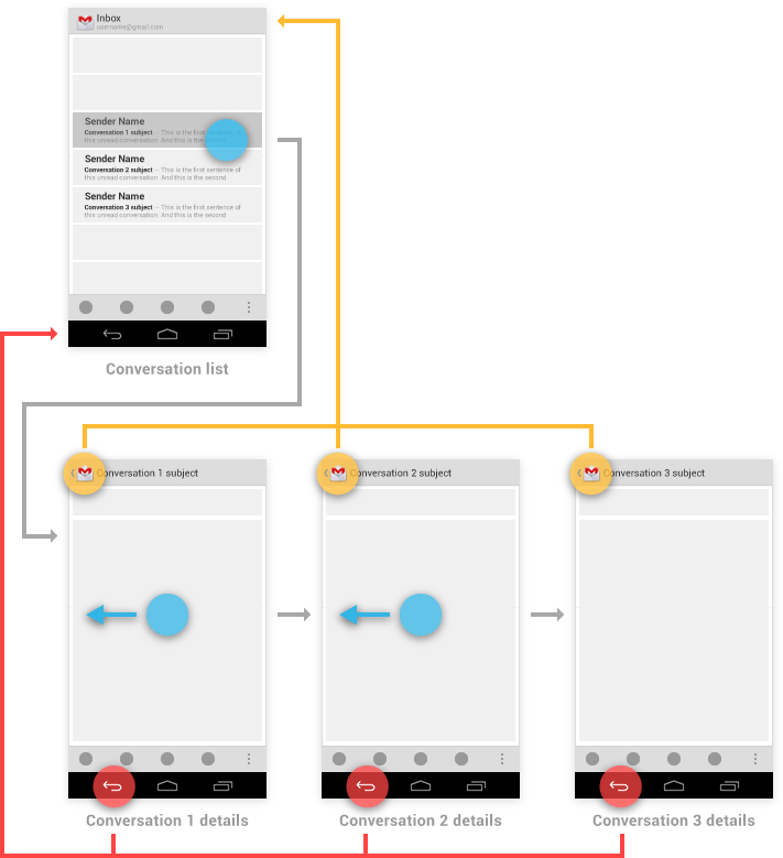
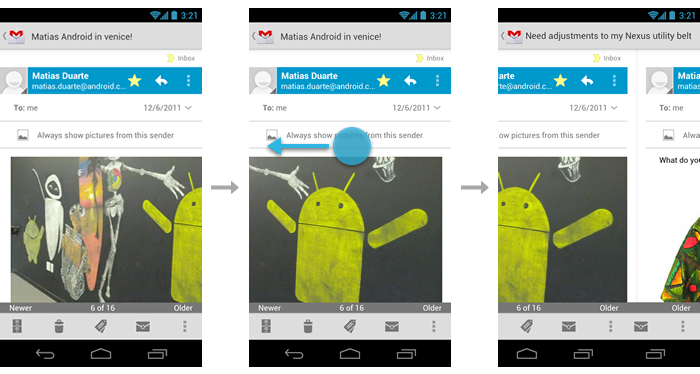
However, a notable exception to this occurs when browsing between related detail views not tied
together by the referring list—for example, when browsing in the Play Store between apps from
the same developer, or albums by the same artist. In these cases, following each link does create
history, causing the Back button to step through each previously viewed screen. Up should continue
to bypass these related screens and navigate to the most recently viewed container screen.
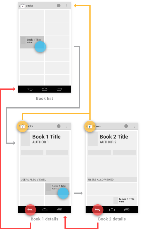
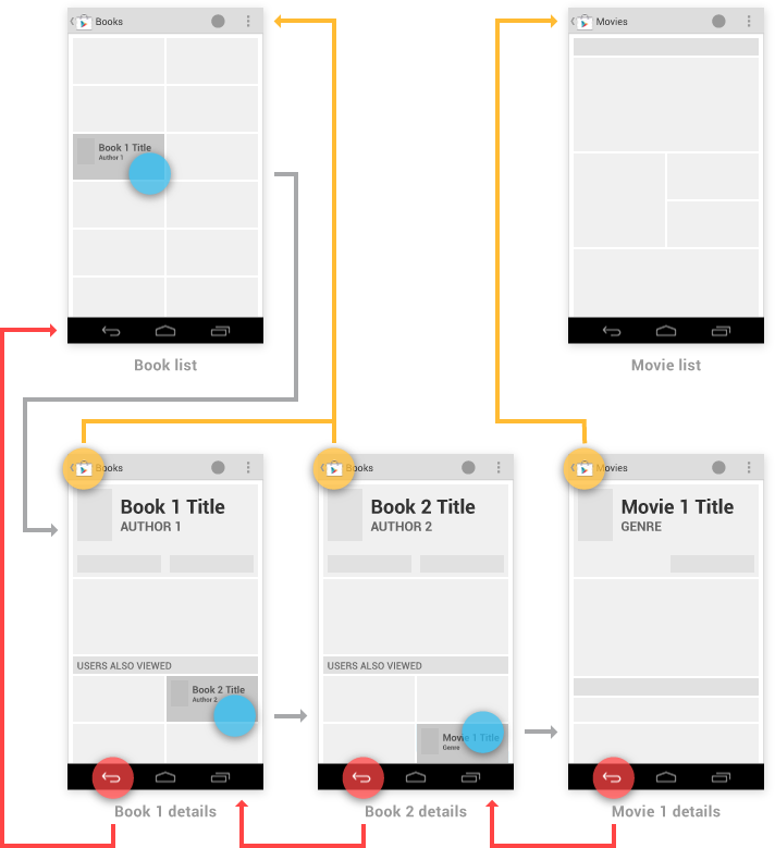
You have the ability to make the Up behavior even smarter based on your knowledge of detail
view. Extending the Play Store example from above, imagine the user has navigated from the last
Book viewed to the details for the Movie adaptation. In that case, Up can return to a container
(Movies) which the user hasn't previously navigated through.
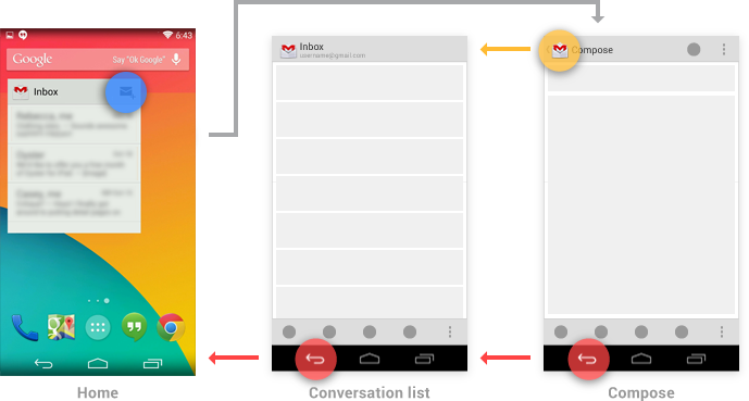
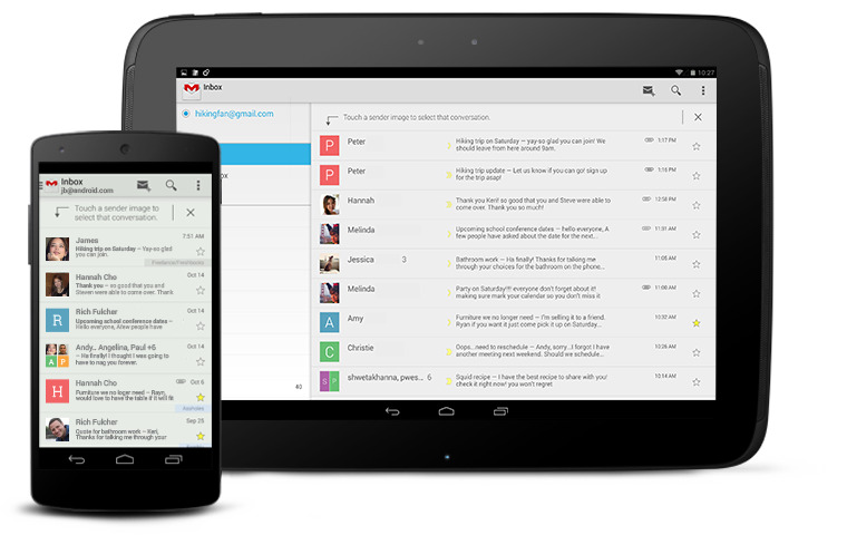
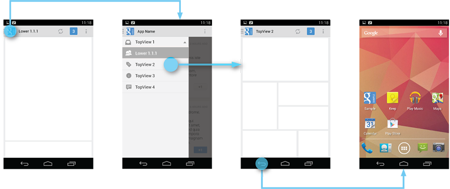
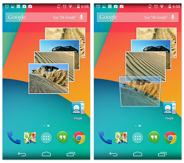
Navigation into Your App via Home Screen Widgets and Notifications
You can use Home screen widgets or notifications to help your users navigate directly to screens
deep within your app's hierarchy. For example, Gmail's Inbox widget and new message notification can
both bypass the Inbox screen, taking the user directly to a conversation view.
For both of these cases, handle the Up button as follows:
- If the destination screen is typically reached from one particular screen within your
app, Up should navigate to that screen.
- Otherwise, Up should navigate to the topmost ("Home") screen of your app.
In the case of the Back button, you should make navigation more predictable by inserting into the
task's back stack the complete upward navigation path to the app's topmost screen. This allows users
who've forgotten how they entered your app to navigate to the app's topmost screen before
exiting.
As an example, Gmail's Home screen widget has a button for diving directly to its compose
screen. Up or Back from the compose screen would take the user to the Inbox, and from there the
Back button continues to Home.
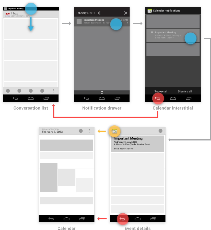
Indirect notifications
When your app needs to present information about multiple events simultaneously, it can use a
single notification that directs the user to an interstitial screen. This screen summarizes these
events, and provides paths for the user to dive deeply into the app. Notifications of this style are
called
indirect notifications.
Unlike standard (direct) notifications, pressing Back from an indirect notification's
interstitial screen returns the user to the point the notification was triggered from—no
additional screens are inserted into the back stack. Once the user proceeds into the app from its
interstitial screen, Up and Back behave as for standard notifications, as described above:
navigating within the app rather than returning to the interstitial.
For example, suppose a user in Gmail receives an indirect notification from Calendar. Touching
this notification opens the interstitial screen, which displays reminders for several different
events. Touching Back from the interstitial returns the user to Gmail. Touching on a particular
event takes the user away from the interstitial and into the full Calendar app to display details of
the event. From the event details, Up and Back navigate to the top-level view of Calendar.
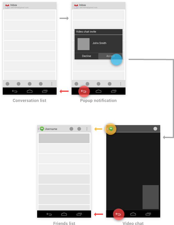
Pop-up notifications
Pop-up notifications bypass the notification drawer, instead appearing directly in
front of the user. They are rarely used, and
should be reserved for occasions where a timely
response is required and the interruption of the user's context is necessary. For example,
Talk uses this style to alert the user of an invitation from a friend to join a video chat, as this
invitation will automatically expire after a few seconds.
In terms of navigation behavior, pop-up notifications closely follow the behavior of an indirect
notification's interstitial screen. Back dismisses the pop-up notification. If the user navigates
from the pop-up into the notifying app, Up and Back follow the rules for standard notifications,
navigating within the app.
Navigation Between Apps
One of the fundamental strengths of the Android system is the ability for apps to activate each
other, giving the user the ability to navigate directly from one app into another. For example, an
app that needs to capture a photo can activate the Camera app, which will return the photo
to the referring app. This is a tremendous benefit to both the developer, who can easily leverage
code from other apps, and the user, who enjoys a consistent experience for commonly performed
actions.
To understand app-to-app navigation, it's important to understand the Android framework behavior
discussed below.
Activities, tasks, and intents
In Android, an
activity is an application component that defines a screen of
information and all of the associated actions the user can perform. Your app is a collection of
activities, consisting of both the activities you create and those you re-use from other apps.
A
task is the sequence of activities a user follows to accomplish a goal. A
single task can make use of activities from just one app, or may draw on activities from a number
of different apps.
An
intent is a mechanism for one app to signal it would like another
app's assistance in performing an action. An app's activities can indicate which intents
they can respond to. For common intents such as "Share", the user may have many apps installed
that can fulfill that request.
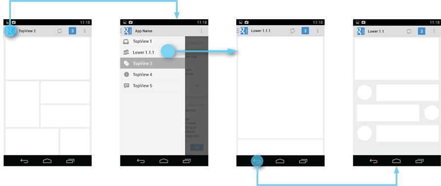
Example: navigating between apps to support sharing
To understand how activities, tasks, and intents work together, consider how one app allows users
to share content by using another app. For example, launching the Play Store app from Home begins
new Task A (see figure below). After navigating through the Play Store and touching a promoted book
to see its details, the user remains in the same task, extending it by adding activities. Triggering
the Share action prompts the user with a dialog listing each of the activities (from different apps)
which have registered to handle the Share intent.
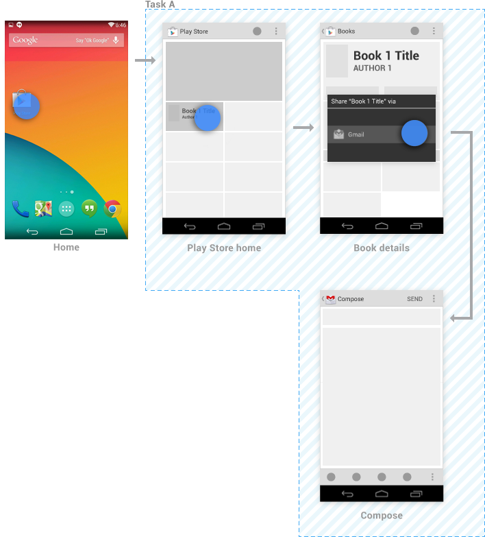
When the user elects to share via Gmail, Gmail's compose activity is added as a continuation of
Task A—no new task is created. If Gmail had its own task running in the background, it would
be unaffected.
From the compose activity, sending the message or touching the Back button returns the user to
the book details activity. Subsequent touches of Back continue to navigate back through the Play
Store, ultimately arriving at Home.
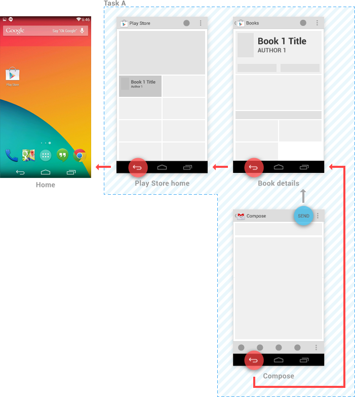
However, by touching Up from the compose activity, the user indicates a desire to remain within
Gmail. Gmail's conversation list activity appears, and a new Task B is created for it. New tasks are
always rooted to Home, so touching Back from the conversation list returns there.
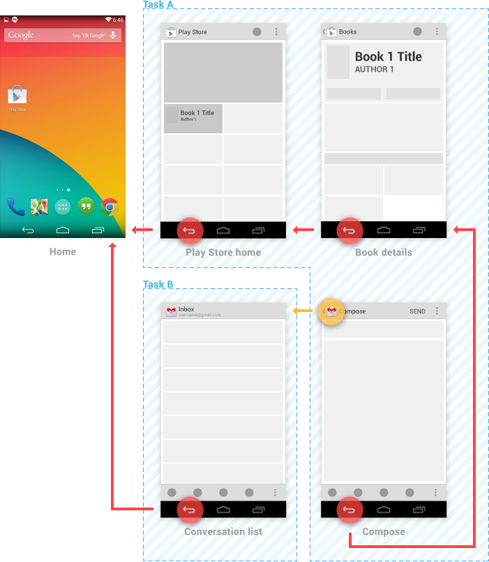
Task A persists in the background, and the user may return to it later (for example, via the
Recents screen). If Gmail already had its own task running in the background, it would be replaced
with Task B—the prior context is abandoned in favor of the user's new goal.
When your app registers to handle intents with an activity deep within the app's hierarchy,
refer to
Navigation into Your App via Home Screen Widgets and
Notifications for guidance on how to specify Up navigation.
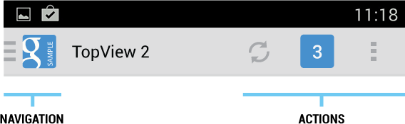
The
action bar is a dedicated piece of real estate at the top of each screen that is generally persistent throughout the app.
It provides several key functions:
- Makes important actions prominent and accessible in a predictable way (such as New or Search).
- Supports consistent navigation and view switching within apps.
- Reduces clutter by providing an action overflow for rarely used actions.
- Provides a dedicated space for giving your app an identity.
If you're new to writing Android apps, note that the action bar is
one of the most important design elements you can implement. Following
the guidelines described here will go a long way toward making your
app's interface consistent with the core Android apps.
General Organization
The action bar is split into four different functional areas that apply to most apps.
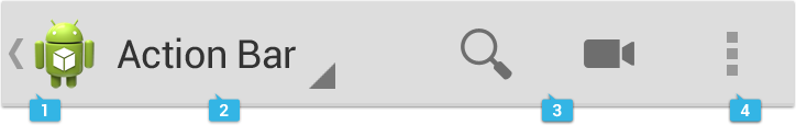
App icon
The app icon establishes your app's identity. It can be replaced with a different logo or branding
if you wish.
Important: If the app is currently not displaying the top-level screen, be sure to display the Up
caret to the left of the app icon, so the user can navigate up the hierarchy. For more discussion of
Up navigation, see the Navigation pattern.
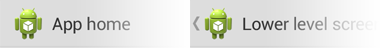
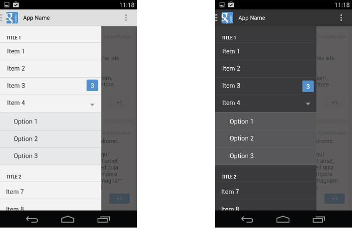
App icon with and without "up" affordance.
View control
If your app displays data in different views, this segment of the action bar allows users to switch
views. Examples of view-switching controls are drop-down menus or tab controls. For more information on view-switching, see the App Structure pattern.
If your app doesn't support different views, you can also use this space to display non-interactive
content, such as an app title or longer branding information.
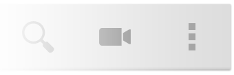
Action buttons
Show the most important actions of your app in the actions section. Actions that don't fit in the
action bar are moved automatically to the action overflow. Long-press on an icon to view the action's name.
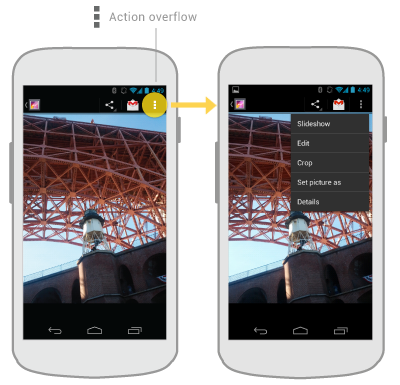
Action overflow
Move less often used actions to the action overflow.
Adapting to Rotation and Different Screen Sizes
One of the most important UI issues to consider when creating an app is how to adjust to screen
rotation on different screen sizes.
You can adapt to such changes by using
split action bars, which allow you to distribute action bar
content across multiple bars located below the main action bar or at the bottom of the screen.
Split action bar showing action buttons at the bottom of the screen in vertical orientation.
Layout Considerations for Split Action Bars
When splitting up content across multiple action bars, you generally have three possible locations
for action bar content:
- Main action bar
- Top bar
- Bottom bar
If the user can navigate up the hierarchy from a given screen, the main action bar contains the up
caret, at a minimum.
To allow the user to quickly switch between the views your app provides, use tabs or a spinner in
the top bar.
To display actions and, if necessary, the action overflow, use the bottom bar.
Action buttons on the action bar surface your app's most
important activities. Think about which
buttons will get used most often, and order them accordingly. Depending
on available screen real
estate, the system shows your most important actions as action buttons
and moves the rest to the
action overflow. The action bar should show only those actions that are
available to the user. If an action is unavailable in the current
context, hide it. Do not show it as disabled.

A sampling of action buttons used throughout the Gmail application.
For guidance on prioritizing actions, use the FIT scheme.
F — Frequent
- Will people use this action at least 7 out of 10 times they visit the screen?
- Will they typically use it several times in a row?
- Would taking an extra step every time truly be burdensome?
I — Important
- Do you want everyone to discover this action because it's especially cool or a selling point?
- Is it something that needs to be effortless in the rare cases it's needed?
T — Typical
- Is it typically presented as a first-class action in similar apps?
- Given the context, would people be surprised if it were buried in the action overflow?
If either F, I, or T apply, then it's appropriate for the action bar. Otherwise, it belongs in the
action overflow.
Pre-defined glyphs should be used for certain common actions such as "refresh" and "share." The
download link below provides a package with icons that are scaled for various screen densities and
are suitable for use with the Holo Light and Holo Dark themes. The package also includes unstyled
icons that you can modify to match your theme, in addition to Adobe® Illustrator® source
files for further customization.
Download the Action Bar Icon Pack
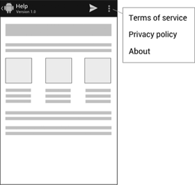
Action overflow
The action overflow in the action bar provides access to your app's less frequently used actions.
The overflow icon only appears on phones that have no menu hardware keys. Phones with menu keys
display the action overflow when the user presses the key.
Action overflow is pinned to the right side.
How many actions will fit in the main action bar? Action bar capacity is controlled by the following
rules:
- Action buttons in the main action bar may not occupy more than 50% of the bar's width. Action
buttons on bottom action bars can use the entire width.
- The screen width in density-independent pixels
(dp)
determine the number of items that will fit in the main action bar:
- smaller than 360 dp = 2 icons
- 360-499 dp = 3 icons
- 500-599 dp = 4 icons
- 600 dp and larger = 5 icons
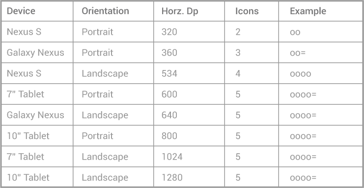
In the above table "o" denotes an action bar item and "=" an overflow icon.
Sharing data
Whenever your app permits sharing of data, such as images or movie clips, use a
share action
provider in your action bar. The share action provider is designed to speed up sharing by
displaying the most recently used sharing service next to a spinner button that contains other
sharing options.
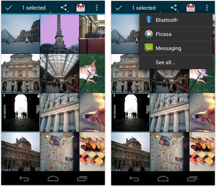
The Gallery app's share action provider with extended spinner for additional sharing options.
Contextual Action Bars
A
contextual action bar (CAB) is a temporary action bar that overlays the app's action bar for the
duration of a particular sub-task. CABs are most typically used for tasks that involve acting on
selected data or text.
Contextual action bar in Browser and Gmail
The selection CAB appears after a long press on a selectable data item triggers selection mode.
From here the user can:
- Select additional elements by touching them.
- Trigger an action from the CAB that applies to all selected data items. The CAB then
automatically dismisses itself.
- Dismiss the CAB via the navigation bar's Back button or the CAB's checkmark button. This removes
the CAB along with all selection highlights.
Use CABs whenever you allow the user to select data via long press. You can control the action
content of a CAB in order to insert the actions you would like the user to be able to perform.
For more information, refer to the
Selection
pattern.
Action Bar Checklist
When planning your split action bars, ask yourself questions like these:
How important is view navigation to the task?
If view navigation is very important to your app, use tabs (for fastest view-switching) or spinners.
Which of the app's actions need to be consistently available
directly from the action bar, and which can be moved to the action
overflow?
Use the
FIT scheme to decide if actions
are displayed at the top-level or can be moved to the action overflow. If the number of top-level
actions exceeds the capacity of the main action bar, display them separately in a bottom action bar.
What else is important enough to warrant continuous display?
Sometimes it is important to display contextual information for your app that's always visible.
Examples are the number of unread messages in a messaging inbox view or the Now Playing information
in a music player. Carefully plan which important information you would like to display and
structure your action bars accordingly.
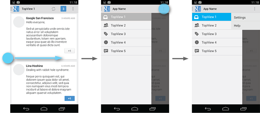
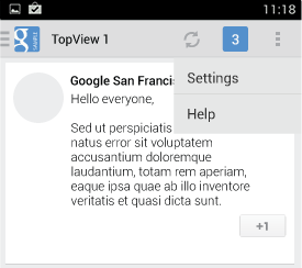
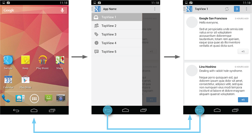
Creating a Navigation Drawer
The navigation drawer is a panel that transitions in from the left edge of the screen and
displays the app’s main navigation options.
Displaying the navigation drawer
The user can bring the navigation drawer onto the screen by swiping from the left edge of the
screen or by touching the application icon on the action bar.
As the navigation drawer expands, it overlays the content but not the action bar. When the
drawer is fully extended, the action bar adjusts its content by replacing the current action
bar title with the app name and removing all actions that are contextual to the view underneath
the navigation drawer. The overflow menu with the standard action items for Settings and Help
remains visible.
The user can open the drawer panel by touching the navigation drawer indicator.
Because they are transient, navigation drawers make views less cluttered. You can also use
them at deeper levels in the navigation hierarchy, allowing users to switch to your app's most
important screens from anywhere in the app.
Open the drawer from anywhere in your app by swiping from the left edge of the screen.
Dismissing the navigation drawer
When the navigation drawer is expanded, the user can dismiss it in one of four ways:
- Touching the content outside the navigation drawer
- Swiping to the left anywhere on the screen (including edge swipe from right)
- Touching the app icon/title in the action bar
- Pressing Back
When to Use the Navigation Drawer
The navigation drawer is not a general replacement for top-level navigation via spinners
or tabs. The structure of your app should guide your choice of which pattern to use for
top-level switching. For more information on top-level switching mechanisms, see the
Application Structure design pattern.
Here are some examples of where navigation drawers work best:
More than 3 top-level views
Navigation drawers are great for displaying a large number of navigation targets
concurrently. Use the navigation drawer if you have more than 3 unique top-level views.
If not, use fixed tabs for top-level organization to ease discovery and interaction.
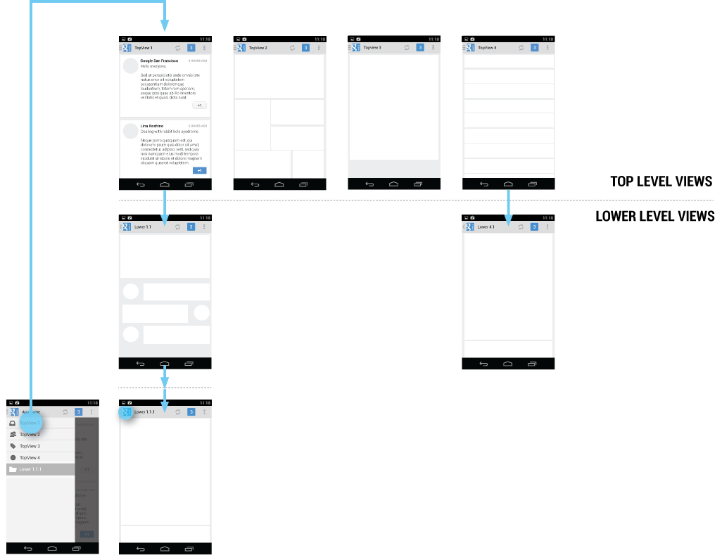
Cross-navigation from lower levels
If your app requires cross-navigating between lower-level screens, consider using the
navigation drawer. Because it is accessible from anywhere in the app, the drawer enables
efficient navigation from lower-level screens to other important places in your app.
The navigation drawer makes cross-navigation at lower levels possible.
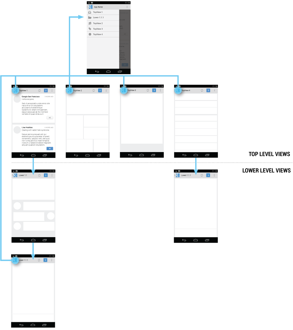
Deep navigation branches
If you have particularly deep branches, navigating to the top-level of your app can become
repetitive and cumbersome with Up and Back alone. Since navigation drawers are accessible from
anywhere in the app, navigation up to the top level is faster and more efficient.
The navigation drawer allows for quick jumps to the top-level of your app, removing the need
for repetitive Back or Up sequences.
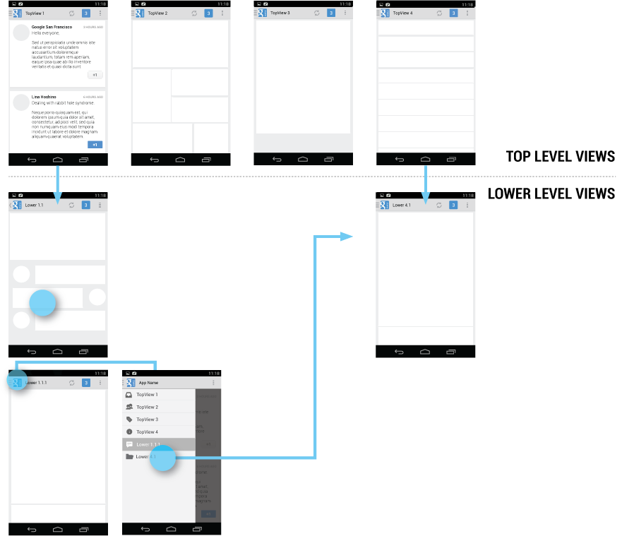
Navigation Hubs
The navigation drawer is a reflection of your app’s structure and displays its major
navigation hubs. Think of navigation hubs as those places in your app that a user will want
to visit frequently or use as a jumping-off point to other parts of the app.
At a minimum, the navigation hubs are the top-level views, since they correspond to your app’s
major functional areas.
If your app’s structure is deep, you can add screens from lower levels that your users will
likely visit often and make those navigation hubs as well.
The navigation drawer contains all of your app's navigation hubs. Include your top level
screens as well as important lower-level screens.
To facilitate access to the navigation drawer on navigation hubs, all screens that
correspond to an entry in your navigation drawer should show the navigation drawer indicator
next to the application icon in the action bar. Touching the app icon causes the navigation
drawer to slide in from the left.
All other lower-level screens show the traditional Up indicator next to the application
icon. The drawer is still accessible with an edge-swipe, but is not featured in the action bar.
App icon with navigation drawer indicator.
Content of the Navigation Drawer
Keep the content of the navigation drawer focused on app navigation. Expose the navigation
hubs of your app as list items inside the navigation drawer - one item per row.
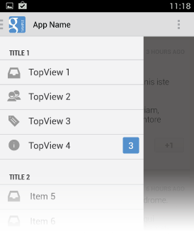
Titles, icons, and counters
You can structure navigation targets by adding titles. The titles are not interactive,
but just organize navigation targets into functional topics. If you have many navigation
targets, use titles to orient the user within the drawer.
Navigation targets can have optional leading icons as well as trailing counters. Use
the counters to inform users about a changed state of data in the corresponding view.
Use titles and icons to organize your drawer.
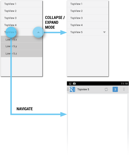
Collapsible navigation items are split. Use the left side for navigation and the right
to collapse and expand items.
Collapsible navigation items
If you have many views with some subordinate to others, consider collapsing them into one
expandable item to conserve space.
The parent in the navigation drawer then turns into a split item. The left side allows
navigation to the parent item’s view, and the right side collapses or expands the list of
child items.
At launch, the initial state of the collapsible items is up to you. As a rule, all
top-level view entries of the navigation drawer should be visible. If you have many collapsible
items, consider collapsing all items to allow the user to see the top-level views in their
entirety.
When the user opens the drawer from a lower-level screen, expand the associated branch
of the top-level view to give a stronger sense of place and highlight navigation opportunities
close to the user’s current
location in the app.
Navigation Drawers and Action Bars
When the user expands the navigation drawer, the task focus switches to selecting an item
from the drawer. Because the drawer does not overlay the action bar, users may not realize that
the items in the action bar do not pertain to the navigation drawer.
To reduce confusion, adjust the content of the action bar to the following, once the drawer
is fully expanded:
- App icon
- App name
- Remove actions from the action bar that are contextual to the underlying view (such as
Create new, Refresh). You may retain actions with global scope, such as “Search”.
- Overflow menu with expected navigation targets, such as Settings and Help.
Clean up the action bar when the drawer is fully expanded. Remove actions that are not needed
and display your app's name in the title area.
Actions
Keep actions on the right side of the action bar and in the overflow
Don’t place actions in the navigation drawer. Actions belong in the action bar, and the
user expects to see them there. Keep in mind that not all applications use the navigation
drawer pattern. It may be tempting to expose all your app’s capabilities in a single place,
but keep the bigger picture in mind. Place your actions where all apps display them.
This also applies to common navigation targets, such as access to Help or the app’s
Settings. As per style guide convention Help and Settings are always located in the action
overflow.
Keep Help and Settings in the overflow.
Contextual action bars
Sometimes the user will be in a state where a contextual action bar (CAB) appears instead
of the app’s action bar. This typically happens when the user selects text or selects multiple
items after a press-and-hold gesture. While the CAB is visible, you should still allow the
user to open the navigation drawer using an edge swipe. However, replace the CAB with the
standard action bar while the navigation drawer is open. When the user dismisses the drawer,
re-display the CAB.
Hide contextual action bars while the drawer is visible.
If the user navigates away from a view with selected content, deselect the content before
before navigating to the new view.
Interaction Details
Introduce the user to the drawer at first use
Upon first launch of your app, introduce the user to the navigation drawer by
automatically opening it. This ensures that users know about the navigation drawer and prompts
them to learn about the structure of your app by exploring its content. Continue showing the
drawer upon subsequent launches until the user actively expands the navigation drawer manually.
Once you know that the user understands how to open the drawer, launch the app with the
navigation drawer closed.
At first use, show the navigation drawer automatically to help the user learn the
functionality and structure of your app.
Give the user a quick peek
If the user touches the very left edge of the screen (within 20 dp from the left), have the
drawer peek out as soon as the finger makes contact with the display. This promotes accidental
discovery and provides richer feedback.
The navigation drawer peeks out when the user touches the very left edge of the screen.
Highlights
When you open the navigation drawer from a screen that is represented inside the drawer,
highlight its entry in the drawer. Vice versa, if you open the drawer from a screen that is
not listed in the drawer, none of the items of the drawer should be highlighted.
Impact of Drawer on Overall App Navigation
The navigation drawer is an alternative to other top-level navigation patterns. To make apps
with navigation drawers work consistently with apps that use a tab or spinner pattern, remember
that all navigation requirements for system Back and Up apply.
Pay special attention to the following situations:
System Back at the top level of the app
Touching System Back at the app’s top level never opens the navigation drawer. Instead,
System Back behaves according to the navigation rules for the top level, such as navigating
to the previous app within the task or navigating to the Home screen.
System Back does not show the drawer, but behaves according to the navigation rules for
the top level.
System Back after cross navigation to lower hierarchy levels
If the user navigates to a lower hierarchy screen from the navigation drawer and the screen
has a direct parent, then the Back stack is reset and Back points to the target screen’s parent.
This Back behavior is the same as when a user navigates into an app from a notification.
Reset the Back stack if your lower-level navigation target has direct parents.
Style
The width of the navigation drawer depends on the content you want to display, but should be
between a minimum of 240 dp and a maximum of 320 dp. The height of the individual line items
should not fall below 48 dp. See the layout guideline below for recommendations on padding and
spacing.
Layout guidelines for the navigation drawer.
Pick the drawer background to best match your app’s theme. See the following examples
for a Holo light and a Holo dark themed drawer.
Navigation drawers in Holo light and Holo dark themed apps.
Navigation Drawer Checklist
Even if you already support a similar navigation drawer, update your drawer to this
pattern to make sure that:
- The action bar remains in place and adjusts its content.
- Your navigation drawer overlays the content.
- Any view represented in the drawer has a navigation drawer indicator in its action bar
that allows the drawer to be opened by touching the app icon.
- You take advantage of the new visual drawer transition.
- Any view not represented in the drawer maintains the traditional Up indicator in its action bar.
- You stay in sync with the general navigation patterns for Up and Back.
Building a Dynamic UI with Fragments
When writing an app for Android, keep in mind that Android devices come in many different screen
sizes and types. Make sure that your app consistently provides a balanced and aesthetically pleasing
layout by adjusting its content to varying screen sizes and orientations.
Panels are a great way for your app to achieve this. They allow you to combine multiple views into
one compound view when a lot of horizontal screen real estate is available and by splitting them up
when less space is available.
Combining Multiple Views Into One
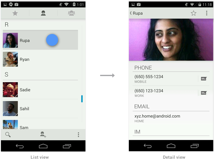
On smaller devices your content is typically divided into a master grid or list view and a detail
view. Touching an item in the master view opens a different screen showing that item's detail
information.
Because tablets have more screen real estate than phones, you can use panels to combine the related
list and detail views into a single compound view. This uses the additional space more efficiently
and makes navigating the app easier.
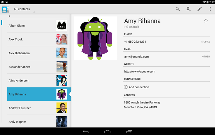
In general, use the pane on the right to present more information about the item you selected in the
left pane. Make sure to keep the item in the left pane selected in order to establish the
relationship between the panels.
Compound Views and Orientation Changes
Screens should strive to have the same functionality regardless of orientation. If you use a compound view in
one orientation, try not to split it up when the user rotates the screen. There are several techniques
you can use to adjust the layout after orientation change while keeping functional parity intact.
Stretch/compress
Adjust the column width of your left pane to achieve a balanced layout in both orientations.
Stack
Rearrange the panels on your screen to match the orientation.
Expand/collapse
When the device rotates, collapse the left pane view to only show the most important information.
Show/hide
If your screen cannot accommodate the compound view on rotation show
the right pane in full screen view on rotation to portrait. Use the Up
icon in action bar to show the parent screen.
Checklist
-
Plan in advance on how your app scales to different screen sizes and screen orientations.
-
Identify the most appropriate method for the panels in your compound views to reorganize
themselves when screen orientation changes.
-
Look for opportunities to consolidate your views into multi-panel compound views.
-
Make sure that your screens try to provide functional parity after the screen orientation
changes.
Creating Swipe Views with Tabs
Efficient navigation is one of the cornerstones of a well-designed app. While apps are generally
built in a hierarchical fashion, there are instances where horizontal navigation can flatten
vertical hierarchies and make access to related data items faster and more enjoyable. Swipe views
allow the user to efficiently move from item to item using a simple gesture and thereby make
browsing and consuming data a more fluent experience.
Swiping Between Detail Views
An app's data is often organized in a master/detail relationship: The user can view a list of
related data items, such as images, chats, or emails, and then pick one of the items to see the
detail contents in a separate screen.
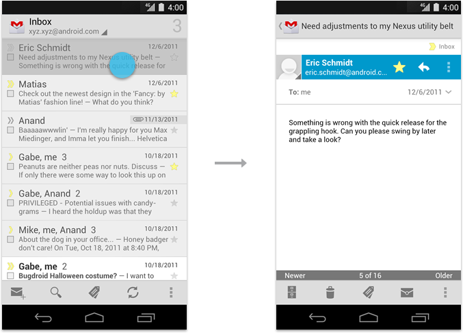
Master (left) and detail (right) views.
On a phone, since the master and detail are on separate screens, this typically requires the user to
jump back and forth between the list and the detail view, aka "pogo-sticking".
In cases where users will want to view multiple detail items in succession, avoid pogo-sticking by
using the swipe gesture to navigate to the next/previous detail view.
Navigating between consecutive Email messages using the swipe gesture.
If a view contains content that exceeds the width of the screen such as
a wide Email message, make sure the user's initial swipes will scroll
horizontally within the view. Once the end of the content is reached, an
additional swipe should navigate to the next view. In addition, support
the use of edge swipes to immediately navigate between views when
content scrolls horizontally.
Scrolling within a wide Email message using the swipe gesture before navigating to the next message.
Swiping Between Tabs
If your app uses action bar tabs, use swipe to navigate between the different views.
Checklist
-
Use swipe to quickly navigate between detail views or tabs.
-
Transition between the views as the user performs the swipe gesture. Do not wait for the
gesture to complete and then transition between views.
-
If you used buttons in the past for previous/next navigation, replace them with
the swipe gesture.
-
Consider adding contextual information in your detail view that informs the user about the
relative list position of the currently visible item.
-
For more details on how to build swipe views, read the developer documentation on Implementing Lateral Navigation.
Menus: Creating Contextual Menus
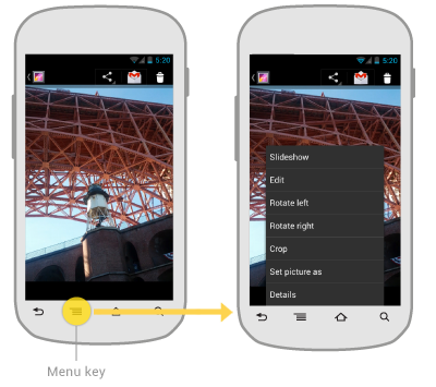
Android 3.0 changed the long press gesture—that is, a touch
that's held in the same position for a moment—to be the global gesture
to select data.. This affects the way you should
handle multi-select and contextual actions in your apps.
What has changed?
In previous versions of Android, the long press gesture was universally used to display contextual
actions for a given data item in a contextual menu.
This pattern changed with Android 3.0. The long press gesture is now used to select data, combining
contextual actions and selection management functions for selected data into a new element called
the contextual action bar (CAB).
Traditional use of the long press gesture to show contextual menus.
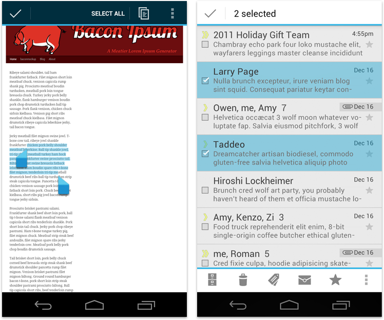
Using the contextual action bar (CAB)
The selection CAB is a temporary action bar that overlays your app's current action bar while data
is selected. It appears after the user long presses on a selectable data item.
From here the user can:
- Select additional data items by touching them.
- Trigger an action from the CAB that applies to all highlighted data items. The CAB then
automatically dismisses itself.
- Dismiss the CAB via the navigation bar's Back button or the CAB's checkmark button. This removes
the CAB along with all selection highlights.
Selecting CAB actions
You can decide which actions and elements appear in the CAB. Use the guidelines in the
Action Bar
pattern to decide which items to surface at the top level and which to move to the
action overflow.
Dynamically adjust CAB actions
In most cases you need to adjust the actions in the CAB dynamically as the user adds more items to
the selection. Actions that apply to a single selected data item don't necessarily apply to multiple
selected data items of the same kind.
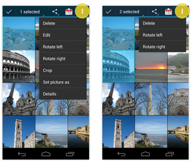
Adjusting actions in the CAB as additional items are selected.
Checklist
-
Whenever your app supports the selection of multiple data items, make use of the contextual action
bar (CAB).
-
Reserve the long press gesture for selection exclusively. Don't use it to display traditional
contextual menus.
-
If you don't support multi-selection within a list, long press should do nothing.
-
Plan the actions you want to display inside of a CAB in the same way you would plan the actions
inside your app's action bar.
 Confirming
 is asking the user to verify that
they truly want to proceed with an action they just invoked. In some
cases, the confirmation is presented along with a warning or critical
information related to the action that they need to consider.
 Acknowledging
 is displaying text to let the user
know that the action they just invoked has been completed. This removes
uncertainty about implicit operations that the system is taking. In
some cases, the acknowledgment is presented along with an option to undo
the action.
Communicating to users in these ways can help alleviate uncertainty
about things that have happened or will happen. Confirming or
acknowledging can also prevent users from making mistakes they might
regret.
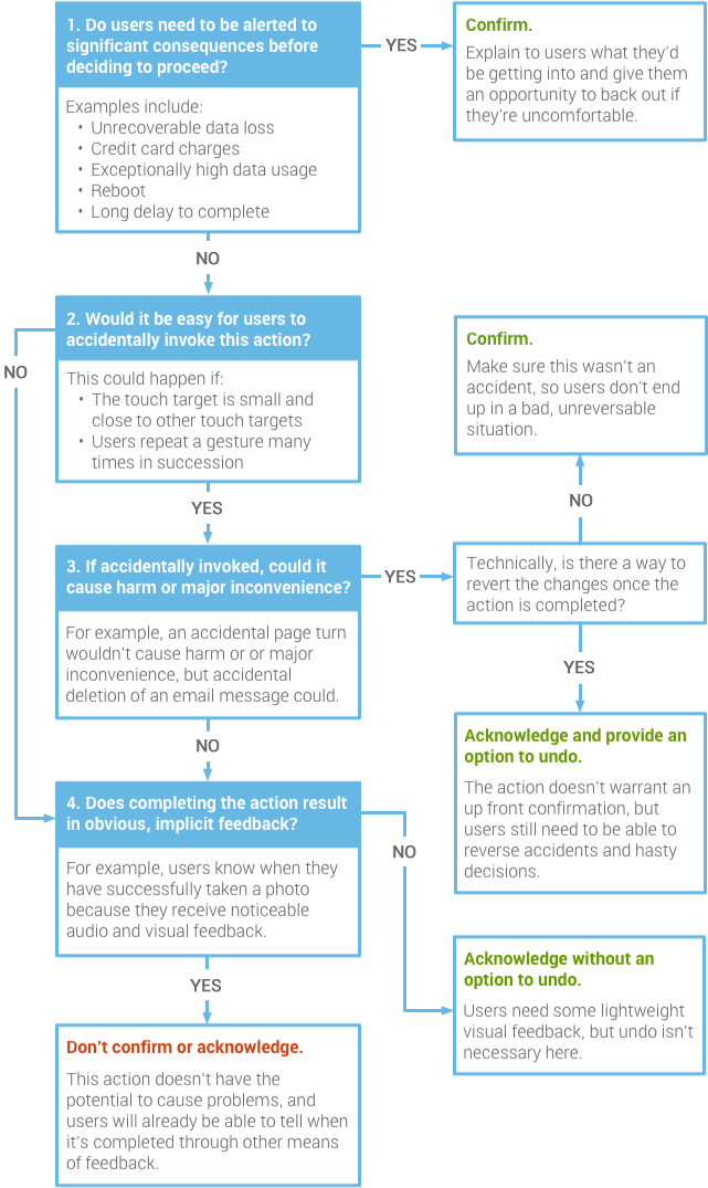
When to Confirm or Acknowledge User Actions
Not all actions warrant a confirmation or an acknowledgment. Use this flowchart to guide your design decisions.
Confirming
Example: Google Play Books
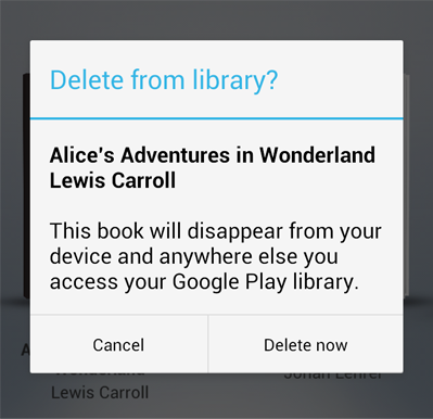
In this example, the user has requested to delete a book from their Google Play library. An
alert appears to confirm this action because it's important to understand that the book will no longer be available from any device.
When crafting a confirmation dialog, make the title meaningful by echoing the requested action.
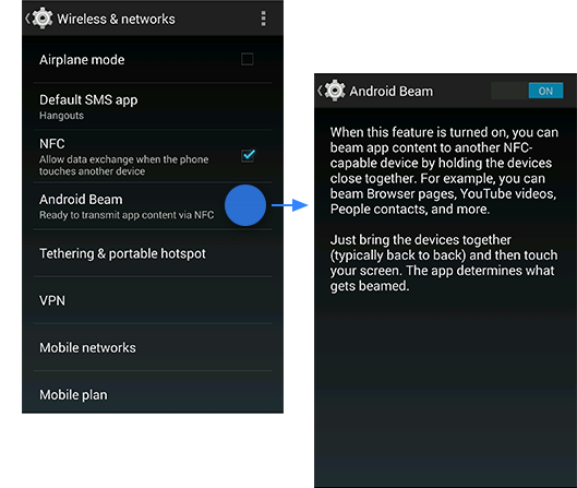
Example: Android Beam
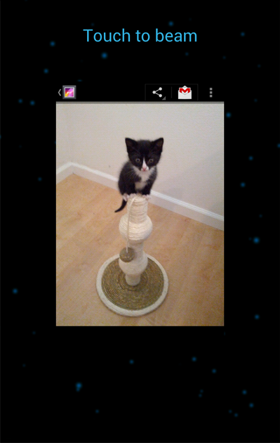
Confirmations don't necessarily have to be presented in an alert
with two buttons. After initiating Android Beam, the user is prompted to
touch the content to be shared (in this example, it's a photo). If they
decide not to proceed, they simply move their phone away.
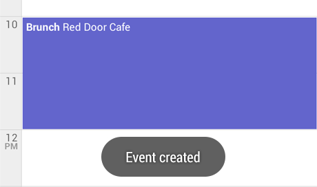
Acknowledging
Example: Abandoned Gmail draft saved
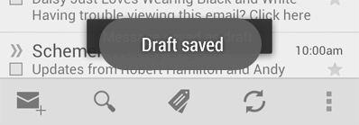
In this example, if the user navigates back or up from the Gmail
compose screen, something possibly unexpected happens: the current draft
is automatically saved. An acknowledgment in the form of a toast makes
that apparent. It fades after a few seconds.
Undo isn't appropriate here because saving was initiated by the
app, not the user. And it's quick and easy to resume composing the
message by navigating to the list of drafts.
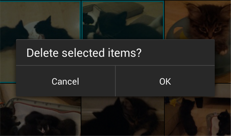
Example: Gmail conversation deleted
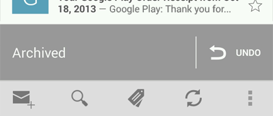
After the user deletes a conversation from the list in Gmail, an
acknowledgment appears with an undo option. The acknowledgment remains
until the user takes an unrelated action, such as scrolling the list.
No Confirmation or Acknowledgment
Example: +1'ing
 Confirmation is unnecessary
. If the user +1'd by accident, it's not a big deal. They can just touch the button again to undo the action.
Acknowledgment is unnecessary. The user will see the +1 button bounce and turn red. That's a very clear signal.
Example: Removing an app from the Home Screen
 Confirmation is unnecessary
. This is a
deliberate action: the user must drag and drop an item onto a relatively
large and isolated target. Therefore, accidents are highly unlikely.
But if the user regrets the decision, it only takes a few seconds to
bring it back again.
Acknowledgment is unnecessary. The user will know the app is gone from the Home Screen because they made it disappear by dragging it away.
The notification system allows your app to keep the user informed
about events, such as new chat messages or a calendar event. Think of
notifications as a news channel that alerts the user to important events
as they happen or a log that chronicles events while the user is not
paying attention.
New in Jelly Bean
In Jelly Bean, notifications received their most important structural and functional update since the beginning of Android.
- Notifications can include actions that enable the user to immediately act on a notification from the notification drawer.
- Notifications are now more flexible in size and layout. They can be expanded to show additional information details.
- A priority flag was introduced that helps to sort notifications by importance rather than time only.
Anatomy of a notification
Base Layout
At a minimum, all notifications consist of a base layout, including:
- the sending application's notification icon or the sender's photo
- a notification title and message
- a timestamp
- a secondary icon to identify the sending application when the senders image is shown for the main icon
The information arrangement of the base layout has not changed in
Jelly Bean, so app notifications designed for versions earlier than
Jelly Bean still look and work the same.
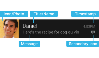
Base layout of a notification
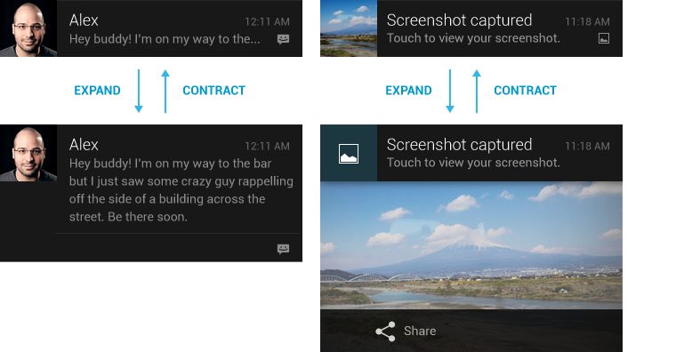
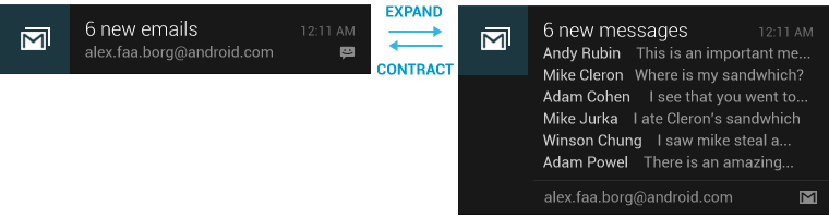
Expanded layouts
With Jelly Bean you have the option to provide more event detail. You
can use this to show the first few lines of a message or show a larger
image preview. This provides the user with additional context, and - in
some cases - may allow the user to read a message in its entirety. The
user can pinch-zoom or two-finger glide in order to toggle between base
and expanded layouts. For single event notifications, Android provides
two expanded layout templates (text and image) for you to re-use in your
application.
Actions
Starting with Jelly Bean, Android supports optional actions that
are displayed at the bottom of the notification. With actions, users can
handle the most common tasks for a particular notification from within
the notification shade without having to open the originating
application. This speeds up interaction and, in conjunction with
"swipe-to-dismiss", helps users to streamline their notification
triaging experience.
Be judicious with how many actions you include with a
notification. The more actions you include, the more cognitive
complexity you create. Limit yourself to the fewest number of actions
possible by only including the most imminently important and meaningful
ones.
Good candidates for actions on notifications are actions that are:
- essential, frequent and typical for the content type you're displaying
- time-critical
- not overlapping with neighboring actions
Avoid actions that are:
- ambiguous
- duplicative of the default action of the notification (such as "Read" or "Open")
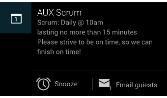
Calendar reminder notification with two actions
You can specify a maximum of three actions, each consisting of an
action icon and an action name. Adding actions to a simple base layout
will make the notification expandable, even if the notification doesn't
have an expanded layout. Since actions are only shown for expanded
notifications and are otherwise hidden, you must make sure that any
action a user can invoke from a notification is available from within
the associated application as well.
Design guidelines
Make it personal
For notifications of items sent by another user (such as a message or status update), include that person's image.
Remember to include the app icon as a secondary icon in the
notification, so that the user can still identify which app posted it.
Navigate to the right place
When the user touches the body of a notification (outside of the
action buttons), open your app to the place where the user can consume
and act upon the data referenced in the notification. In most cases this
will be the detail view of a
single data item such as a message, but it might also be a summary view
if the notification is stacked (see
Stacked notifications
below) and references multiple items. If in any of those cases the user
is taken to a hierarchy level below your app's top-level, insert
navigation into your app's back stack to allow them to navigate to your
app's top level using the system back key. For more
information, see the chapter on
System-to-app navigation in the
Navigation design pattern.
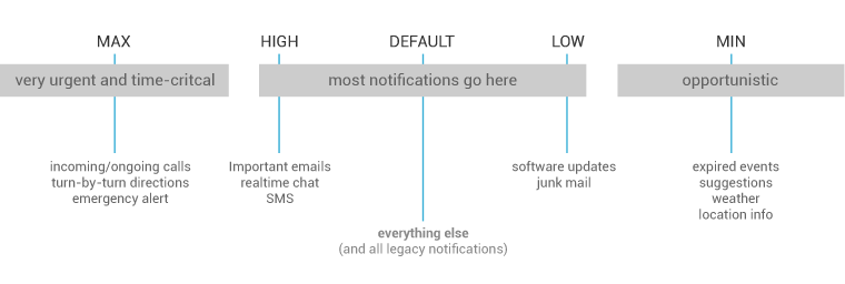
Correctly set and manage notification priority
Starting with Jelly Bean, Android now supports a priority flag for
notifications. It allows you to influence where your notification will
appear in comparison to other notifications and help to make sure that
users always see their most important notifications first. You can
choose from the following priority levels when posting a notification:
| Priority |
Use |
| MAX |
Use for critical and urgent notifications that alert the user to
a condition that is time-critical or needs to be resolved before they
can continue with a particular task. |
| HIGH |
Use high priority notifications primarily for important
communication, such as message or chat events with content that is
particularly interesting for the user. |
| DEFAULT |
The default priority. Keep all notifications that don't fall into any of the other categories at this priority level. |
| LOW |
Use for notifications that you still want the user to be informed about, but that rate low in urgency. |
| MIN |
Contextual/background information (e.g. weather information,
contextual location information). Minimum priority notifications
will not show in the status bar. The user will only discover them when
they expand the notification tray. |
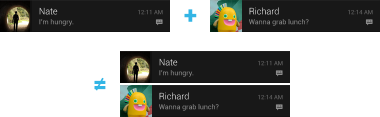
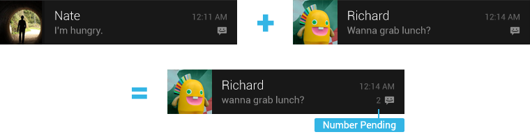
Stack your notifications
If your app creates a notification while another of the same type is still pending, avoid creating
an altogether new notification object. Instead, stack the notification.
A stacked notification builds a summary description and allows the user to understand how many
notifications of a particular kind are pending.
Don't:
 Do
Do:
You can provide more detail about the individual notifications that
make up a stack by using the expanded digest layout. This allows users
to gain a better sense of which notifications are pending and if they
are interesting enough to be read in detail within the associated app.
Make notifications optional
Users should always be in control of notifications. Allow the user to
disable your apps notifications or change their alert properties, such
as alert sound and whether to use vibration, by adding a notification
settings item to your application settings.
Use distinct icons
By glancing at the notification area, the user should be able to discern what kinds of notifications are currently pending.
Do
Look at the notification icons the Android apps
already provide and create notification icons for your app that are
sufficiently distinct in appearance.
Do
Do
Keep your icons visually simple and avoid excessive detail that is hard to discern.
Don't
Use color to distinguish your app from others.
Pulse the notification LED appropriately
Many Android devices contain a tiny lamp, called the notification
LED,
which is used to keep the user informed about events while the screen
is off. Notifications with a priority level of MAX, HIGH, or DEFAULT
should cause the LED to glow, while those with lower priority (LOW and
MIN) should not.
The user's control over notifications should extend to the LED. By
default, the LED will glow with a white color. Your notifications
shouldn't use a different color unless the user has explicitly
customized it.
Building notifications that users care about
To create an app that feels streamlined, pleasant, and respectful, it
is important to design your notifications carefully. Notifications
embody your app's voice, and contribute to your app's personality.
Unwanted or unimportant notifications can annoy the user, so use them
judiciously.
When to display a notification
To create an application that people love, it's important to recognize that the user's attention and
focus is a resource that must be protected. While Android's notification system has been designed
to minimize the impact of notifications on the users attention, it is nonetheless still important
to be aware of the fact that notifications are potentially interrupting the users task flow. As you
plan your notifications, ask yourself if they are important enough to warrant an interruption. If
you are unsure, allow the user to opt into a notification using your apps notification settings or
adjust the notifications priority flag.
While well behaved apps generally only speak when spoken to, there are some limited cases where an
app actually should interrupt the user with an unprompted notification.
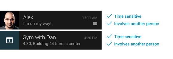
Notifications should be used primarily for
time sensitive events, and especially if these
synchronous events
involve other people. For instance, an incoming chat is a real time and
synchronous form of communication: there is another user actively waiting on you to respond.
Calendar events are another good example of when to use a notification and grab the user's
attention, because the event is imminent, and calendar events often involve other people.
When not to display a notification
There are however many other cases where notifications should not be used:
-
Avoid notifying the user of information that is not directed
specifically at them, or information that is not truly time sensitive.
For instance the asynchronous and undirected updates flowing through a
social network generally do not warrant a real time interruption. For
the users that do care about them, allow them to opt-in.
-
Don't create a notification if the relevant new information is
currently on screen. Instead, use the UI of the application itself to
notify the user of new information directly in context. For instance, a
chat application should not create system notifications while the user
is actively chatting with another user.
-
Don't interrupt the user for low level technical operations, like
saving or syncing information, or updating an application, if it is
possible for the system to simply take care of itself without involving
the user.
-
Don't interrupt the user to inform them of an error if it is possible
for the application to quickly recover from the error on its own
without the user taking any action.
-
Don't create notifications that have no true notification content and
merely advertise your app. A notification should inform the user about a
state and should not be used to merely launch an app.
-
Don't create superfluous notifications just to get your brand in front of users. Such
notifications will only frustrate and likely alienate your audience. The best way to provide the
user with a small amount of updated information and to keep them engaged with your application is to
develop a widget that they can choose to place on their home screen.
Interacting With Notifications
Notifications are indicated by icons in the notification area and can be accessed by opening the notification drawer.
Inside the drawer, notifications are chronologically sorted with
the latest one on top. Touching a notification opens the associated app
to detailed content matching the notification. Swiping left or right on a
notification removes it from the drawer.
On tablets, the notification area is integrated with the system bar
at the bottom of the screen. The notification drawer is opened by
touching anywhere inside the notification area.
Ongoing notifications
Ongoing notifications keep users informed about an ongoing process in
the background. For example, music players announce the currently
playing track in the notification system and continue to do so until the
user stops the playback. They can also be used to show the user
feedback for longer tasks like downloading a file, or encoding a video.
Ongoing notifications cannot be manually removed from the notification
drawer.
Dialogs and toasts are for feedback not notification
Your app should not create a dialog or toast if it is not
currently on screen. Dialogs and Toasts should only be displayed as the
immediate response to the user taking an action inside of your app. For
further guidance on the use of dialogs and toasts, refer to
Confirming & Acknowledging.
Widgets are an essential aspect of home screen customization. You can
imagine them as "at-a-glance" views of an app's most important data and
functionality that is accessible right from the user's home screen.
Users can move widgets across their home screen panels, and, if
supported, resize them to tailor the amount of information within a
widget to their preference.
Widget types
As you begin planning your widget, think about what kind of widget
you're trying to build. Widgets typically fall into one of the following
categories:
Information widgets
Information widgets typically display a few crucial information
elements that are important to a user and track how that information
changes over time. Good examples for information widgets are weather
widgets, clock widgets or sports score trackers. Touching information
widgets typically launches the associated app and opens a detail view of
the widget information.
Collection widgets
As the name implies, collection widgets specialize in displaying
multitude elements of the same type, such as a collection of pictures
from a gallery app, a collection of articles from a news app or a
collection of emails/messages from a communication app. Collection
widgets typically focus on two use cases: browsing the collection, and
opening an element of the collection to its detail view for consumption.
Collection widgets can scroll vertically.
ListView widget
GridView widget
Control widgets
The main purpose of a control widget is to display often used
functions that the user can trigger right from the home screen without
having to open the app first. Think of them as remote controls for an
app. A typical example of control widgets are music app widgets that
allow the user to play, pause or skip music tracks from outside the
actual music app.
Interacting with control widgets may or may not progress to an
associated detail view depending on if the control widget's function
generated a data set, such as in the case of a search widget.
Hybrid widgets
While all widgets tend to gravitate towards one of the three types
described above, many widgets in reality are hybrids that combine
elements of different types.
For the purpose of your widget planning, center your widget around
one of the base types and add elements of other types if needed.
A music player widget is primarily a control widget, but also keeps the
user informed about what track is currently playing. It essentially
combines a control widget with elements of an information widget type.
Widget limitations
While widgets could be understood as "mini apps", there are certain
limitations that are important to understand before you start to embark
on designing your widget:
Gestures
Because widgets live on the home screen, they have to co-exist with
the navigation that is established there. This limits the gesture
support that is available in a widget compared to a full-screen app.
While apps for example may support a view pager that allows the user to
navigate between screens laterally, that gesture is already taken on the
home screen for the purpose of navigating between home panels.
The only gestures available for widgets are:
Elements
Given the above interaction limitations, some of the UI building
blocks that rely on restricted gestures are not available for widgets.
For a complete list of supported building blocks and more information on
layout restrictions, please refer to the "Creating App Widget Layouts"
section in the
App Widgets API Guide.
Design guidelines
Widget content
Widgets are a great mechanism to attract a user to your app by
"advertising" new and interesting content that is available for
consumption in your app.
Just like the teasers on the front page of a newspaper, widgets
should consolidate and concentrate an app's information and then provide
a connection to richer detail within the app; or in other words: the
widget is the information "snack" while the app is the "meal." As a
bottom line, always make sure that your app shows more detail about an
information item than what the widget already displays.
Widget navigation
Besides the pure information content, you should also consider to
round out your widget's offering by providing navigation links to
frequently used areas of your app. This lets users complete tasks
quicker and extends the functional reach of the app to the home screen.
Good candidates for navigation links to surface on widgets are:
- Generative functions: These are the functions that allow the user
to create new content for an app, such as creating a new document or a
new message.
- Open application at top level: Tapping on an information element
will usually navigate the user to a lower level detail screen. Providing
access to the top level of your application provides more navigation
flexibility and can replace a dedicated app shortcut that users would
otherwise use to navigate to the app from the home screen. Using your
application icon as an affordance can also provide your widget with a
clear identity in case the data you're displaying is ambiguous.
Widget resizing
With version 3.1, Android introduced resizable widgets to the
platform. Resizing allows users to adjust the height and/or the width of
a widget within the constraints of the home panel placement grid. You
can decide if your widget is freely resizable or if it is constrained to
horizontal or vertical size changes. You do not have to support
resizing if your particular widget is inherently fixed-size.
Allowing users to resize widgets has important benefits:
- They can fine-tune how much information they want to see on each widget.
- They can better influence the layout of widgets and shortcuts on their home panels.
A long press and subsequent release sets resizable widgets into
resize mode. Users can use the drag handles or the widget corners to set
the desired size.
Planning a resize strategy for your widget depends on the type of
widget you're creating. List or grid-based collection widgets are
usually straightforward because resizing the widget will simply expand
or contract the vertical scrolling area. Regardless of the of the
widget's size, the user can still scroll all information elements into
view. Information widgets on the other hand require a bit more hands-on
planning, since they are not scrollable and all content has to fit
within a given size. You will have to dynamically adjust your widget's
content and layout to the size the user defined through the resize
operation.

In this simple example the user can horizontally resize a weather
widget in 4 steps and expose richer information about the weather at the
current location as the widget grows.
For each widget size determine how much of your app's information
should surface. For smaller sizes concentrate on the essential and then
add more contextual information as the widget grows horizontally and
vertically.
Layout considerations
It will be tempting to layout your widgets according to the
dimensions of the placement grid of a particular device that you own and
develop with. This can be a useful initial approximation as you layout
your widget, but keep the following in mind:
- The number, size and spacing of cells can vary widely from device
to device, and hence it is very important that your widget is flexible
and can accommodate more or less space than anticipated.
- In fact, as the user resizes a widget, the system will respond
with a dp size range in which your widget can redraw itself. Planning
your widget resizing strategy across "size buckets" rather than variable
grid dimensions will give you the most reliable results.
Widget configuration
Sometimes widgets need to be setup before they can become useful.
Think of an email widget for example, where you need to provide an
account before the inbox can be displayed. Or a static photo widget
where the user has to assign the picture that is to be displayed from
the gallery.
Android widgets display their configuration choices right after
the widget is dropped onto a home panel. Keep the widget configuration
light and don't present more than 2-3 configuration elements. Use
dialog-style instead of full-screen activities to present configuration
choices and retain the user's context of place, even if doing so
requires use of multiple dialogs.
Once setup, there typically is not a lot of reason to revisit the
setup. Therefore Android widgets do not show a "Setup" or
"Configuration" button.
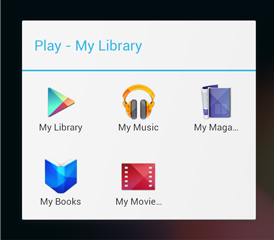
After adding a Play widget to a home panel, the widget asks the
user to specify the type of media the widget should display.
Checklist
- Focus on small portions of glanceable information on your widget. Expand on the information in your app.
- Choose the right widget type for your purpose.
- For resizable widgets, plan how the content for your widget should adapt to different sizes.
- Make your widget orientation and device independent by ensuring that the layout is capable of stretching and contracting.
Settings is a place in your app where users indicate their preferences for how your app should
behave. This benefits users because:
- You don't need to interrupt them with the same questions over and over when certain situations
arise. The settings predetermine what will always happen in those situations (see design
principle: Decide for me but
let me have the final say).
- You help them feel at home and in control (see design principle:
Let me make it mine).
Flow and Structure
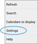
Provide access to Settings in the action overflow
Settings is given low prominence in the UI because it's not frequently needed. Even if there's
room in the
action bar, never make Settings
an action button. Always keep it in the action overflow and label it "Settings". Place it below
all other items except "Help".
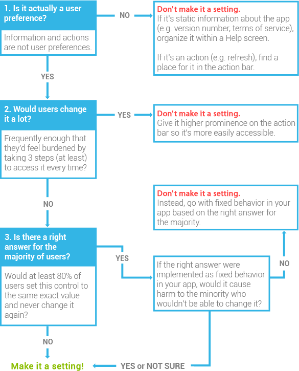
Avoid the temptation to make everything a setting
Because Settings is a few navigational steps away, no matter how many items you have, they'll
never clutter up the core part of your UI. This may seem like good news, but it also poses a
challenge.
Settings can be a tempting place to keep a lot of stuff—like a hall closet where things
get stashed when you tidy up before company comes over. It's not a place where you spend lots of
time, so it's easy to rationalize and ignore its cluttered condition. But when users visit
Settings—however infrequently—they'll have the same expectations for the experience as
they do everywhere else in your app. More settings means more choices to make, and too many are
overwhelming.
So don't punt on the difficult product decisions and debates that can bring on the urge to
"just make it a setting". For each control you're considering adding to Settings, make sure it
meets the bar:
If you still have lots of settings, group related settings together
The number of items an average human can hold in short-term memory is 7±2. If you
present a list of 10 or more settings (even after applying the criteria above), users will have
more difficulty scanning, comprehending, and processing them.
You can remedy this by dividing some or all of the settings into groups, effectively turning
one long list into multiple shorter lists. A group of related settings can be presented in one of
two ways:
Under a section divider
In a separate subscreen
You can use one or both these grouping techniques to organize your app's settings.
For example, in the main screen of the Android Settings app, each item in the list navigates
to a subscreen of related settings. In addition, the items themselves are grouped under section
dividers.
Grouping settings is not an exact science, but here's some advice for how to approach it, based
on the total number of settings in your app.
7 or fewer
Don't group them at all. It won't benefit users and will seem like overkill.
8 to 10
Try grouping related settings under 1 or 2 section dividers. If you have any "singletons"
(settings that don't relate to any other settings and can't be grouped under your section
dividers), treat them as follows:
- If they include some of your most important settings, list them at the top without a section
divider.
- Otherwise, list them at the bottom with a section divider called "OTHER", in order of
importance.
11 to 15
Same advice as above, but try 2 to 4 section dividers.
Also, try the following to reduce the list:
- If 2 or more of the settings are mainly for power users, move them out of your main Settings
screen and into an "Advanced" subscreen. Place an item in the action overflow called "Advanced" to
navigate to it.
- Look for "doubles": two settings that relate to one another, but not to any other settings.
Try to combine them into one setting, using the design patterns described later in this section.
For example, you might be able to redesign two related checkbox settings into one multiple choice
setting.
16 or more
If you have any instances of 4 or more related settings, group them under a subscreen. Then use
the advice suggested above for the reduced list size.
Design Patterns
Checkbox
Use this pattern for a setting that is either selected or not selected.
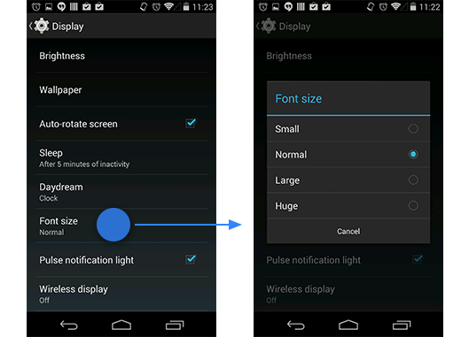
Multiple choice
Use this pattern for a setting that needs to present a discrete set of options, from which the
user can choose only one.
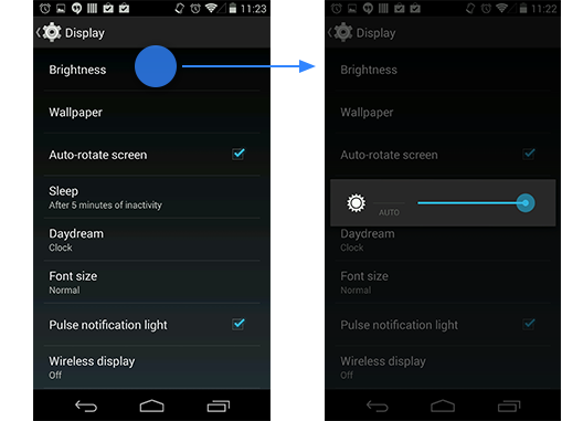
Slider
Use this pattern for a setting where the range of values are not discrete and fall along a
continuum.
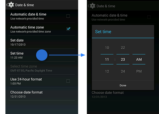
Date/time
Use this pattern for a setting that needs to collect a date and/or time from the user.
Subscreen navigation
Use this pattern for navigating to a subscreen or sequence of subscreens that guide the user
through a more complex setup process.
- If navigating to a single subscreen, use the same title in both the subscreen and the label
navigating to it.
- If navigating to a sequence of subscreens (as in this example), use a title that describes the
first step in the sequence.
List subscreen
Use this pattern for a setting or category of settings that contains a list of equivalent items.
The label provides the name of the item, and secondary text may be used for status. (In this
example, status is reinforced with an icon to the right of the label.) Any actions associated with
the list appear in the action bar rather than the list itself.
Master on/off switch
Use this pattern for a category of settings that need a mechanism for turning on or off as a
whole.
An on/off switch is placed as the first item in the action bar of a subscreen. When the switch
is turned off, the items in the list disappear, replaced by text that describes why the list is
empty. If any actions require the switch to be on, they become disabled.
You can also echo the master on/off switch in the menu item that leads to the subscreen.
However, you should only do this in cases where users rarely need to access the subscreen once
it's initially set up and more often just want to toggle the switch.
Individual on/off switch
Use this pattern for an individual setting that requires a more elaborate description than can
be provided in checkbox form.
The on/off switch only appears in the subscreen so that users aren't able to toggle it without
also being exposed to the descriptive text. Secondary text appears below the setting label to
reflect the current selection.
In this example, Android Beam is on by default. Since users might not know what this setting
does, we made the status more descriptive than just "On".
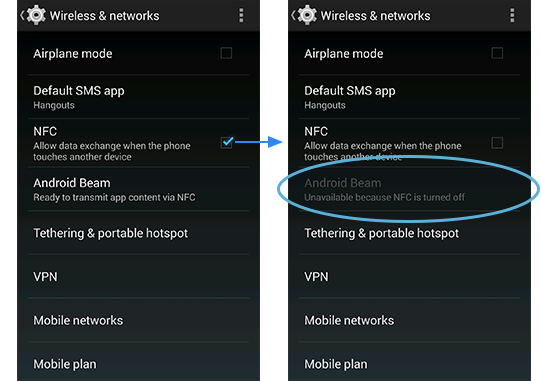
Dependency
Use this pattern for a setting that changes availability based on the value of another setting.
The disabled setting appears below its dependency, without any indentation. If the setting
includes a status line, it says "Unavailable", and if the reason isn't obvious, a brief
explanation is included in the status.
If a given setting is a dependency to 3 or more settings, consider using a subscreen with a
master on/off switch so that your main settings screen isn't cluttered by lots of disabled items.
Defaults
Take great care in choosing default values for each of your settings. Because settings
determine app behavior, your choices will contribute to users' first impressions of your app. Even
though users can change settings, they'll expect the initial states to be sensible. The following
questions (when applicable) may help inform your decisions:
- Which choice would most users be likely to choose on their own if there were no default?
- Which choice is the most neutral or middle-of-the-road?
- Which choice is the least risky, controversial, or over-the-top?
- Which choice uses the least amount of battery or mobile data?
- Which choice best supports the design principle
Never lose my stuff?
- Which choice best supports the design principle
Only interrupt
me if it's important?
Writing Guidelines
Label clearly and concisely
Writing a good label for a setting can be challenging because space is very limited. You only
get one line, and it's incredibly short on the smallest of devices. Follow these guidelines to
make your labels brief, meaningful, and scannable:
- Write each label in sentence case (i.e. only the first word and proper nouns are capitalized).
- Don't start a label with an instructional verb like "Set", "Change", "Edit", "Modify",
"Manage", "Use", "Select", or "Choose". Users already understand that they can do these things to
settings.
- Likewise, don't end a label with a word like "setting" or "settings". It's already implied.
- If the setting is part of a grouping, don't repeat the word(s) used in the section divider or
subscreen title.
- Avoid starting a label with a negative word like "Don't" or "Never". For example, "Don't
allow" could be rephrased to "Block".
- Steer clear of technical jargon as much as possible, unless it's a term widely understood by
your target users. Use common verbs and nouns to convey the setting's purpose rather than its
underlying technology.
- Don't refer to the user. For example, for a setting allowing the user to turn notifications on
or off, label it "Notifications" instead of "Notify me".
Once you've decided on labels for your settings, be sure to preview them on an
LDPI handset in portrait to make sure
they'll fit everywhere.
Secondary text below is for status, not description…
Before Ice Cream Sandwich, we often displayed secondary text below a label to further describe
it or provide instructions. Starting in Ice Cream Sandwich, we're using secondary text for status.
Before
|
Screen timeout
|
|
Adjust the delay before the screen automatically turns off
|
After
|
Sleep
|
|
After 10 minutes of inactivity
|
Status in secondary text has the following benefits:
- Users can see at a glance what the current value of a setting is without having to navigate
any further.
- It applies the design principle
Keep it brief, which
users greatly appreciate.
…unless it's a checkbox setting
There's one important exception to the using secondary text for status: checkbox settings.
Here, use secondary text for description, not status. Status below a checkbox is unnecessary
because the checkbox already indicates it. The reason why it's appropriate to have a description
below a checkbox setting is because—unlike other controls—it doesn't display a dialog
or navigate to another screen where additional information can be provided.
That said, if a checkbox setting's label is clear enough on its own, there's no need to also
provide a description. Only include one if necessary.
Follow these guidelines to write checkbox setting descriptions:
- Keep it to one sentence and don't use ending punctuation.
- Convey what happens when the setting is checked, phrased in the form of a command. Example:
"Allow data exchange", not "Allows data exchange".
- Avoid repetition by choosing words that don't already appear in the label.
- Don't refer to the user unless it's necessary for understanding the setting.
- If you must refer to the user, do so in the second person ("you") rather than the first person
("I"). Android speaks to users, not on behalf of them.
Writing examples
The following are examples of changes we made to labels and secondary text in the Settings app
in Ice Cream Sandwich.
In this checkbox setting, we eliminated the throwaway word "Use" and rephrased the label to be
more direct and understandable.
Before
|
Screen timeout
|
|
Adjust the delay before the screen automatically turns off
|
After
|
Sleep
|
|
After 10 minutes of inactivity
|
In this multiple choice setting, we changed the label to a friendlier term and also replaced
the description with status. We put some descriptive words around the selected value, "10
minutes", because on its own, the meaning could be misinterpreted as "sleep for 10 minutes".
Before
|
Change screen lock
|
|
Change or disable pattern, PIN, or password security
|
This setting navigates to a a sequence of subscreens that allow users to choose a type of
screen lock and then set it up. We eliminated the throwaway word "Change" in the label, and
replaced the description with the current type of screen lock set up by the user. If the user
hasn't set up a screen lock, the secondary text says "None".
Before
|
NFC
|
|
Use Near Field Communication to read and exchange tags
|
After
|
NFC
|
|
Allow data exchange when the phone touches another device
|
In this checkbox setting—although it's technical jargon—we kept the "NFC" label
because: (1) we couldn't find a clear, concise alternative, and (2) user familiarity with the
acronym is expected to increase dramatically in the next couple of years.
We did, however, rewrite the description. It's far less technical than before and does a better
job of conveying how and why you'd use NFC. We didn't include what the acronym stands for because
it doesn't mean anything to most users and would have taken up a lot of space.
Checklist
- Make sure each item in Settings meets the criteria for belonging there.
- If you have more than 7 items, explore ways to group related settings.
- Use design patterns wherever applicable so users don't face a learning curve.
- Choose defaults that are safe, neutral, and fit the majority of users.
- Give each setting a clear, concise label and use secondary text appropriately.
We wish we could guarantee that if you follow every piece of
advice on this website, everyone will be able to learn and use your app
without a hitch. Sadly, that's not the case.
Some of your users will run into questions or problems along the way. They'll be looking for answers
within your app, and if they don't find them quickly, they may leave and never come back.
This page covers design patterns for making help accessible in your
app and tips for creating help content for users who are eager for
assistance.
Designing Help into Your App
Don't show unsolicited help, except in very limited cases
Naturally, you want everyone to quickly learn the ropes, discover the
cool features, and get the most out of your app. So you might be
tempted to present a one-time introductory slideshow, video, or splash
screen to all new users when they first open the app. Or you might be
drawn to the idea of displaying helpful text bubbles or dialogs when
users interact with certain features for the first time.
In almost all cases, we advise
against approaches like these because:
- They're interruptions. People will be eager to
start using your app, and anything you put in front of them will feel
like an obstacle or possibly an annoyance, despite your good intentions.
And because they didn't ask for it, they probably won't pay close
attention to it.
- They're usually not necessary. If you have
usability concerns about an aspect of your app, don't just throw help at
the problem. Try to solve it in the UI. Apply Android design patterns,
styles, and building blocks, and you'll go a long way in reducing the
need to educate your users.
The only reason for showing pure help content to new users unsolicited is:
To teach high value functionality that's only available through a gesture.
For example, we use help content to teach users how to place apps on their Home Screen. This functionality is:
- High value
Without it, users wouldn't be able to customize the most frequently visited Android screen to meet their needs.
- Available only through a gesture
Because there's no button or menu for it, users might not ever discover it on their own.
However, not all high value gesture-only functionality needs a
tutorial. For example, don't teach users how to scroll content. They
already know how because it's a fundamental, system-wide interaction.
The first time each user visits the All Apps screen, a semi-transparent overlay appears to teach an important gesture.
Bottom line: when it comes to offering help in your app, it's much better to let users come to you when they need it.
Follow the standard design for navigating to help
On every screen in your app, offer help in the
action overflow. Always make it the very last item in the menu and label it "Help".
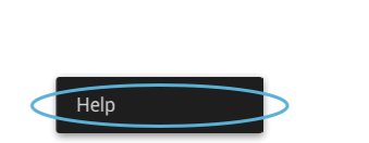
Even if your screen has no other action overflow items, "Help" should appear there and not be promoted to the action bar.
We've established this standard design so that when users are
desperate for help, they won't have to hunt to find it (see design
principle:
Give me tricks that work everywhere).
Assume that every call for help is urgent
In addition to help, you might want to expose other information, such
as copyright info, credits, terms of service, and privacy policy.
Let users access this information through the Help menu item, but
optimize the flow for people with urgent questions about how to do
something or why something is happening in your app. The smaller subset
of users who are looking for legal fine print or the names of the people
who created the app won't be as burdened by taking a few extra steps.
The same is true for any communication options you might want to
provide, such as contacting customer support or submitting feedback.
Offer these options in a way that doesn't add an extra step before users
see help. When you put the help content forward, you increase the
likelihood that users will find the answers on their own, which in turn
reduces your support costs.
When someone chooses "Help":
Don't
Present a dialog asking them to choose between help and other options.
Better
Immediately launch a web browser with help content. Place other options in a footer.
Even Better
Build a help screen in your app and offer other options in the
action bar. For example, you could let users contact you with questions
or feedback through an action button. The action overflow is the ideal
place for non-help information that users rarely need.
This requires more development work than launching a web browser,
but it's a nicer experience for users because they don't leave your app
to get the help they need and doesn't require a network connection.
Principles for Writing On-Screen Help Content
Help is part of the UI
On-screen help is an extension of your app's UI, not a description of
it. All words on the screen from the core app to the help should follow
our
Writing Style principles so that the end-to-end experience feels seamless and cohesive.
Make every pixel count
It's not necessary to document every single detail about your app,
especially things that are extremely apparent just by looking at the UI,
or behaviors that are standard for the platform. Surface just the key
additional information that the on-screen text doesn't have room to
describe, in a way that makes it easy to map to the screen.
Pictures are faster than words
In describing key UI elements and providing step-by-step
instructions, consider combining text with icons, partial screenshots
with callouts, and other imagery. You'll need fewer words to explain
things, and users will absorb the information more quickly.
Help me scan, not read
People don't read help from start to finish. They scan around,
looking for a piece of information containing the answer they need. Make
it less burdensome with friendly formatting and layout choices like
bold headings, bulleted and numbered lists, tables, and white space
between paragraphs. And if you have a large amount of content, divide it
into multiple screens to cut down on scrolling.
Take me straight to the answer
What's better than a screen that's easy to scan? A screen that
requires no scanning at all because the answer's right there. Consider
having each screen in your app navigate to help that's relevant just to
that screen. We call this
contextual help, and it's the holy
grail of user assistance. If you take this approach, be sure to also
provide a way to get to the rest of the help content.
Supporting Different Devices
Significant changes in Android 3.0 included:
- Deprecation of navigation hardware keys (Back, Menu, Search, Home) in favor of handling navigation
via virtual controls (Back, Home, Recents).
- Robust pattern for the use of menus in action bars.
Android 4.0 brings these changes for tablets to the phone platform.
Adapting Android 4.0 to Older Hardware and Apps
Phones with virtual navigation controls
Android apps written for Android 3.0 and later display actions in the action bar. Actions that don't
fit in the action bar or aren't important enough to be displayed at the top level appear in the
action overflow.
Users access the action overflow by touching it in the action bar.
Phones with physical navigation keys
Android phones with traditional navigation hardware keys don't display the virtual navigation bar at
the bottom of the screen. Instead, the action overflow is available from the menu hardware key. The
resulting actions popup has the same style as in the previous example, but is displayed at the bottom of the screen.
Legacy apps on phones with virtual navigation controls
When you run an app that was built for Android 2.3 or earlier on a phone with virtual navigation
controls, an action overflow control appears at the right side of the virtual navigation bar. You
can touch the control to display the app's actions in the traditional Android menu styling.
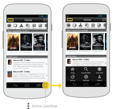
Implementing Accessibility
One of Android's missions is to organize the world's information and
make it universally accessible and useful. Accessibility is the measure
of how successfully a product can be used by people with varying
abilities. Our mission applies to all users-including people with
disabilities such as visual impairment, color deficiency, hearing loss,
and limited dexterity.
Universal design
is the practice of making products that are inherently accessible to
all users, regardless of ability. The Android design patterns were
created in accordance with universal design principles, and following
them will help your app meet basic usability standards. Adhering to
universal design and enabling Android's accessibility tools will make
your app as accessible as possible.
Robust support for accessibility will increase your app's user base. It may also be required for adoption by some organizations.
Android includes several features that support access for users with
visual impairments; they don't require drastic visual changes to your
app.
- TalkBack
is a pre-installed screen reader service provided by Google. It uses
spoken feedback to describe the results of actions such as launching an
app, and events such as notifications.
- Explore by Touch is a system feature that works
with TalkBack, allowing you to touch your device's screen and hear
what's under your finger via spoken feedback. This feature is helpful to
users with low vision.
- Accessibility settings let you modify your
device's display and sound options, such as increasing the text size,
changing the speed at which text is spoken, and more.
Some users use hardware or software directional controllers (such as a
D-pad, trackball, keyboard) to jump from selection to selection on a
screen. They interact with the structure of your app in a linear
fashion, similar to 4-way remote control navigation on a television.
The Android design principle "I should always know where I am" is key
for accessibility concerns. As a user navigates through an application,
they need feedback and a mental model of where they are. All users
benefit from a strong sense of information hierarchy and an architecture
that makes sense. Most users benefit from visual and haptic feedback
during their navigation (such as labels, colors, icons, touch feedback)
Low vision users benefit from explicit verbal descriptions and large
visuals with high contrast.
As you design your app, think about the labels and notations needed
to navigate your app by sound. When using Explore by Touch, the user
enables an invisible but audible layer of structure in your application.
Like any other aspect of app design, this structure can be simple,
elegant, and robust. The following are Android's recommended guidelines
to enable effective navigation for all users.
Make navigation intuitive
Design well-defined, clear task flows with minimal navigation steps,
especially for major user tasks. Make sure those tasks are navigable via
focus controls.
Use recommended touch target sizes
48 dp is the recommended touch target size for on screen elements. Read about
Android Metrics and Grids
to learn about implementation strategies to help most of your users.
For certain users, it may be appropriate to use larger touch targets. An
example of this is educational apps, where buttons larger than the
minimum recommendations are appropriate for children with developing
motor skills and people with manual dexterity challenges.
Label visual UI elements meaningfully
In your wireframes,
label functional UI components
that have no visible text. Those components might be buttons, icons,
tabs with icons, and icons with state (like stars). Developers can use
the
contentDescription attribute to set the label.
- group
- all contacts
- favorites
- search
- action overflow button
-
when starred: remove from favorites
when not starred: add to favorties
- action overflow button
- text message
- video chat
Provide alternatives to affordances that time out
Your app may have icons or controls that disappear after a certain
amount of time. For example, five seconds after starting a video,
playback controls may fade from the screen.
Due to the way that TalkBack works, those controls are not read out
loud unless they are focused on. If they fade out from the screen
quickly, your user may not even be aware that they are available.
Therefore, make sure that you are not relying on timed out controls for
high priority task flows. (This is a good universal design guideline
too.) If the controls enable an important function, make sure that the
user can turn on the controls again and/or their function is duplicated
elsewhere. You can also change the behavior of your app when
accessibility services are turned on. Your developer may be able to make
sure that timed-out controls won't disappear.
Use standard framework controls or enable TalkBack for custom controls
Standard Android framework controls work automatically with
accessibility services and have ContentDescriptions built in by default.
An oft-overlooked system control is font size. Users can turn on a
system-wide large font size in Settings; using the default system font
size in your application will enable the user's preferences in your app
as well. To enable system font size in your app, mark text and their
associated containers to be measured in
scale pixels.
Also, keep in mind that when users have large fonts enabled or speak a
different language than you, their type might be larger than the space
you've allotted for it. Read
Devices and Displays and
Supporting Multiple Screens for design strategies.
If you use custom controls, Android has the developer tools in place
to allow adherence to the above guidelines and provide meaningful
descriptions about the UI. Provide adequate notation on your wireframes
and direct your developer to the
Custom Views documentation.
Try it out yourself
Turn on the TalkBack service in
Settings > Accessibility and navigate your application using directional controls or eyes-free navigation.
Checklist
- Make navigation intuitive
- Use recommended touch target sizes
- Label visual UI elements meaningfully
- Provide alternatives to affordances that time out
- Use standard framework controls or enable TalkBack for custom controls
- Try it out yourself


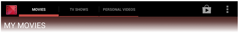
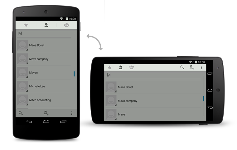
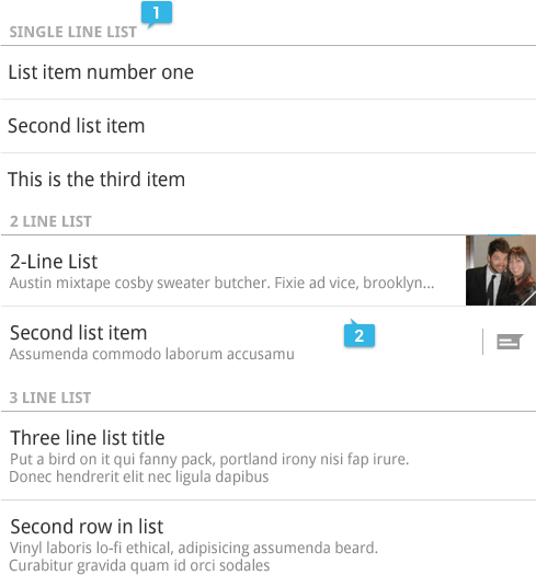
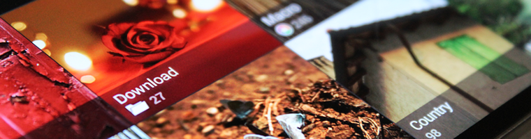
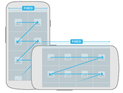
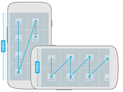
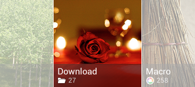
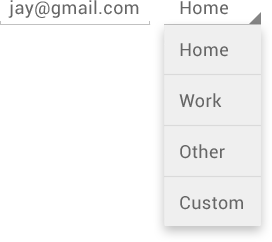
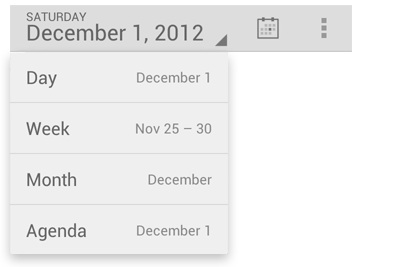


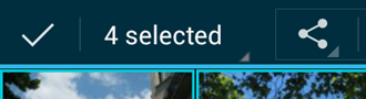
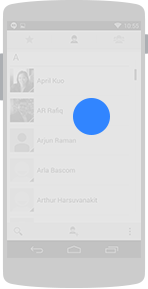
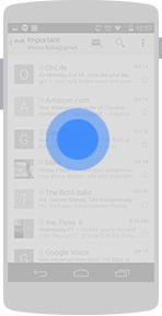
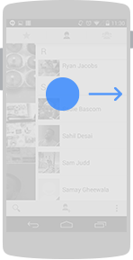
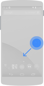
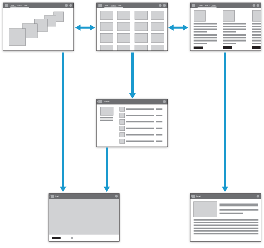
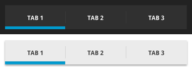
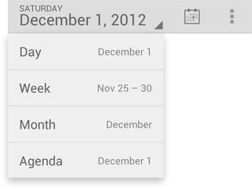
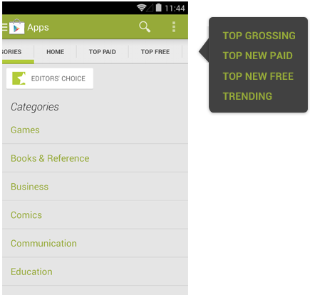
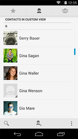
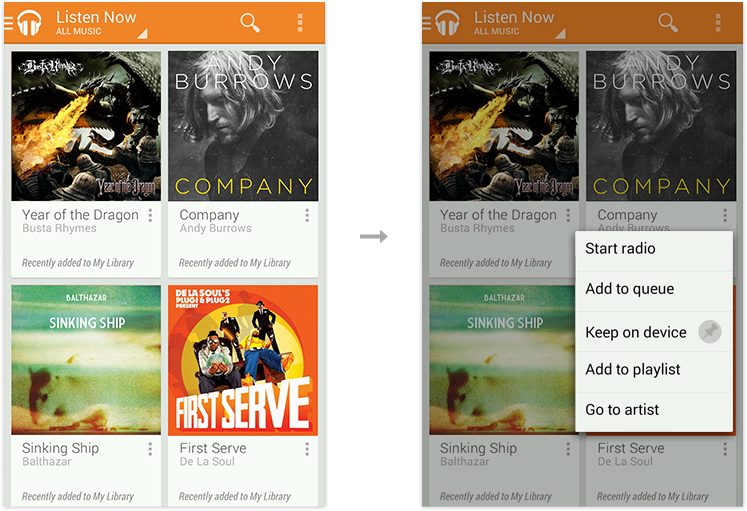
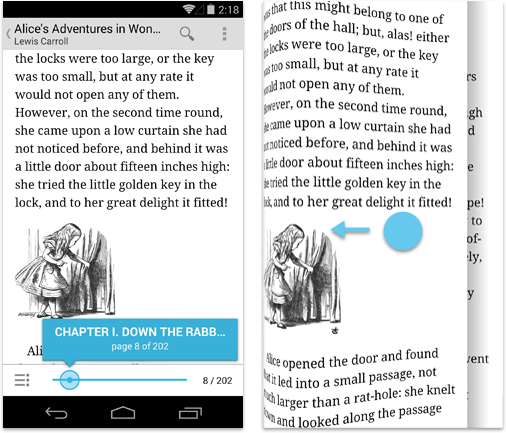

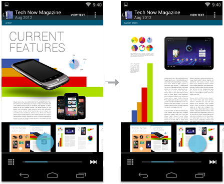
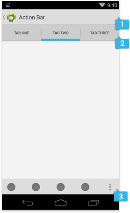
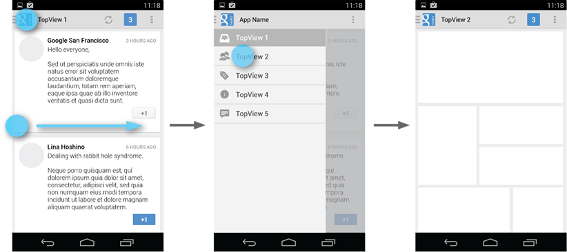
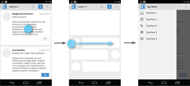
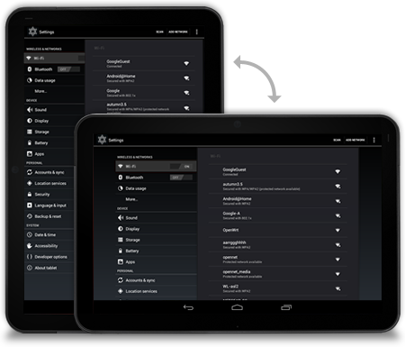
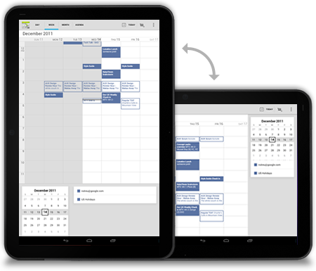
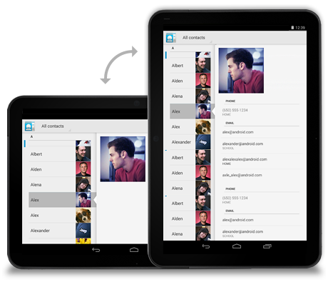
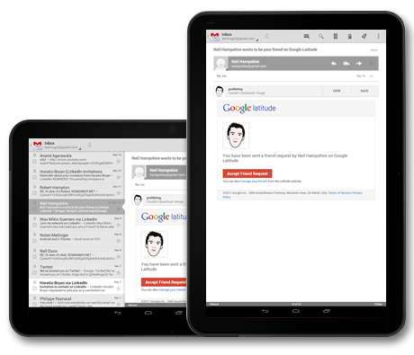
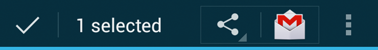
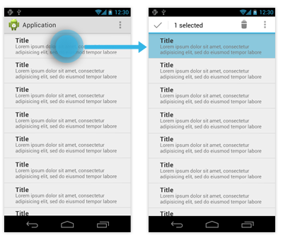
