1. Devices and Displays
Android powers millions of phones, tablets, and other devices in a wide variety of screen sizes and
form factors. By taking advantage of Android's flexible layout system, you can create apps that
gracefully scale from large tablets to smaller phones.
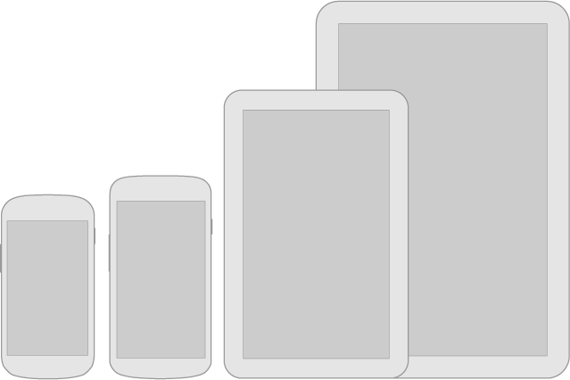
For details about designing layouts for larger screens, see the Multi-pane Layouts guide.

Be flexible
Stretch and compress your layouts to accommodate various heights and widths.Optimize layouts
On larger devices, take advantage of extra screen real estate. Create compound views that combine multiple views to reveal more content and ease navigation.Assets for all
Provide resources for different screen densities (DPI) to ensure that your app looks great on any device.
Strategies
So where do you begin when designing for multiple screens? One approach is to work in the base standard (normal size and MDPI) and scale it up or down for the other buckets. Another approach is to start with the device with the largest screen size, and then scale down and figure out the UI compromises you'll need to make on smaller screens.For details about designing layouts for larger screens, see the Multi-pane Layouts guide.
2. Themes
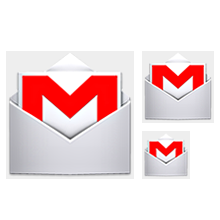
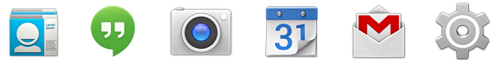
Gmail in Holo Light.
Settings in Holo Dark.
Talk in Holo Light with dark action bar.
Themes are Android's mechanism for applying a consistent style to an app or activity. The style
specifies the visual properties of the elements that make up your user interface, such as color,
height, padding and font size. To promote greater cohesion between all apps on the platform, Android
provides three system themes that you can choose from when building apps for Ice Cream Sandwich:
Pick the system theme that best matches the needs and design aesthetics for your app. If your desire is to have a more distinct look for your app, using one of the system themes as a starting point for your customizations is a good idea. The system themes provide a solid foundation on top of which you can selectively implement your own visual stylings.
 Users can select a system-wide scaling factor for text in the Settings app. In order to support
these accessibility features, type should be specified in scale-independent pixels
(sp)
wherever possible. Layouts supporting scalable types should be tested against these settings.
Users can select a system-wide scaling factor for text in the Settings app. In order to support
these accessibility features, type should be specified in scale-independent pixels
(sp)
wherever possible. Layouts supporting scalable types should be tested against these settings.
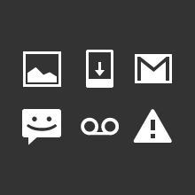
 An icon is a graphic that takes up a small portion of screen real estate and provides a quick,
intuitive representation of an action, a status, or an app.
An icon is a graphic that takes up a small portion of screen real estate and provides a quick,
intuitive representation of an action, a status, or an app.
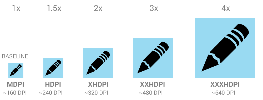
When you design icons for your app, it's important to keep in mind that your app may be installed on a variety of devices that offer a range of pixel densities, as mentioned in Devices and Displays. But you can make your icons look great on all devices by providing each icon in multiple sizes. When your app runs, Android checks the characteristics of the device screen and loads the appropriate density-specific assets for your app.
Because you will deliver each icon in multiple sizes to support different densities, the design guidelines below refer to the icon dimensions in dp units, which are based on the pixel dimensions of a medium-density (MDPI) screen.
So, to create an icon for different densities, you should follow the 2:3:4:6 scaling
ratio between the four primary densities (medium, high, x-high, and xx-high,
respectively). For example, consider that the size for a launcher icon is specified to be
48x48 dp. This means the baseline (MDPI) asset is 48x48 px, and the
high density (HDPI) asset should be 1.5x the baseline at 72x72 px, and the x-high
density (XHDPI) asset should be 2x the baseline at 96x96 px, and so on.
The launcher icon is the visual representation of your app on the Home or All Apps screen. Since the user can change the Home screen's wallpaper, make sure that your launcher icon is clearly visible on any type of background.
Action bar icons are graphic buttons that represent the most important actions people can take within your app. Each one should employ a simple metaphor representing a single concept that most people can grasp at a glance.
Pre-defined glyphs should be used for certain common actions such as "refresh" and "share." The download link below provides a package with icons that are scaled for various screen densities and are suitable for use with the Holo Light and Holo Dark themes. The package also includes unstyled icons that you can modify to match your theme, in addition to Adobe® Illustrator® source files for further customization.
Download the Action Bar Icon Pack


Enabled: 60% opacity
Disabled: 30% opacity
Colors: #FFFFFF
Enabled: 80% opacity
Disabled: 30% opacity
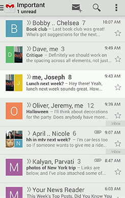
Within the body of your app, use small icons to surface actions and/or provide status for specific items. For example, in the Gmail app, each message has a star icon that marks the message as important.
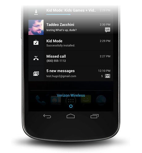
If your app generates notifications, provide an icon that the system can display in the status bar whenever a new notification is available.
Here are some tips you might find useful as you create icons or other drawable assets for your application. These tips assume you are using Adobe® Photoshop® or a similar raster and vector image-editing program.
Using vectors also makes it easy to align edges and corners to pixel boundaries at smaller resolutions.
Note that you are not required to use a shared prefix of any
type—doing so is for your convenience only.
For comparison, here's the resources directory structure of a typical application:
- Holo Light
- Holo Dark
- Holo Light with dark action bars
Pick the system theme that best matches the needs and design aesthetics for your app. If your desire is to have a more distinct look for your app, using one of the system themes as a starting point for your customizations is a good idea. The system themes provide a solid foundation on top of which you can selectively implement your own visual stylings.
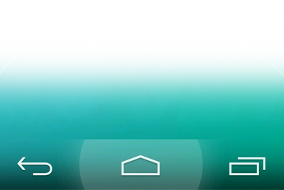
3. Touch
Use color and illumination to respond to touches, reinforce the resulting behaviors of gestures, and
indicate what actions are enabled and disabled.
Whenever a user touches an actionable area in your app, provide a visual response. This lets the user know which object was touched and that your app is "listening".
Whenever a user touches an actionable area in your app, provide a visual response. This lets the user know which object was touched and that your app is "listening".
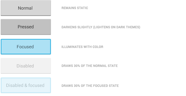
States
Most of Android's UI elements have touch-feedback built in, including states that indicate
whether touching the element will have any effect.
Communication
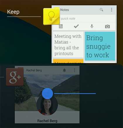
When your objects react to more complex gestures, help users understand what the outcome of the operation will be. For example, in Recents, when you start swiping a thumbnail left or right, it starts to dim. This helps the user understand that swiping will cause the item to be removed.
Boundaries
When users try to scroll past the upper or lower limit of a scrollable area, communicate the boundary with a visual cue. For example, if a user attempts to scroll past the first home screen panel, the screen content tilts to the right to indicate that further navigation in this direction is not possible. Many of Android's scrollable UI widgets (e.g. lists or grid lists) already have support for boundary feedback built in. If you are building custom, keep boundary feedback in mind and provide it from within your app.4. Metrics and Grids
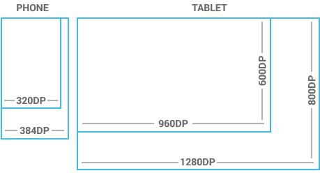
Devices vary not only in physical size, but also in screen density (DPI). To simplify the way you design for multiple screens, think of each device as
falling into a particular size bucket and density bucket:
Because it's important that you design and implement your layouts for multiple densities, the guidelines below and throught the documentation refer to layout dimensions with dp measurements instead of pixels.
To see more, visit the Screen Sizes and Densities Device Dashboard.
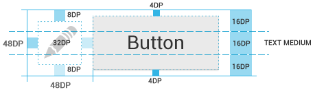
Touchable UI components are generally laid out along 48dp units.

If you design your elements to be at least 48dp high and wide you can guarantee that:
- The size buckets are handset (smaller than 600dp) and tablet (larger than or equal 600dp).
- The density buckets are LDPI, MDPI, HDPI, XHDPI, and XXHDPI.
Because it's important that you design and implement your layouts for multiple densities, the guidelines below and throught the documentation refer to layout dimensions with dp measurements instead of pixels.
Space considerations
Devices vary in the amount of density-independent pixels (dp) they can display.To see more, visit the Screen Sizes and Densities Device Dashboard.
48dp Rhythm
Touchable UI components are generally laid out along 48dp units.
Why 48dp?
On average, 48dp translate to a physical size of about 9mm (with some variability). This is comfortably in the range of recommended target sizes (7-10 mm) for touchscreen objects and users will be able to reliably and accurately target them with their fingers.If you design your elements to be at least 48dp high and wide you can guarantee that:
- your targets will never be smaller than the minimum recommended target size of 7mm regardless of what screen they are displayed on.
- you strike a good compromise between overall information density on the one hand, and targetability of UI elements on the other.
Mind the gaps
Spacing between each UI element is 8dp.Examples
5. Typography
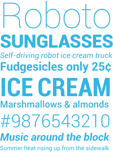
Download Roboto
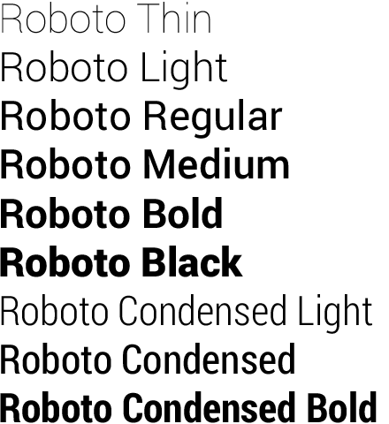
The Android design language relies on traditional typographic tools such as scale, space, rhythm, and alignment with an underlying grid. Successful deployment of these tools is essential to help users quickly understand a screen of information. To support such use of typography, Ice Cream Sandwich introduced a new type family named Roboto, created specifically for the requirements of UI and high-resolution screens.
The current
 Specimen Book
The Android design language relies on traditional typographic tools such as scale, space, rhythm, and alignment with an underlying grid. Successful deployment of these tools is essential to help users quickly understand a screen of information. To support such use of typography, Ice Cream Sandwich introduced a new type family named Roboto, created specifically for the requirements of UI and high-resolution screens.
The current
TextView framework offers Roboto in thin, light, regular and bold
weights, along with an italic style for each weight. The framework also offers the
Roboto Condensed
variant in regular and bold weights, along with an italic style for each weight.
Specimen BookDefault type colors
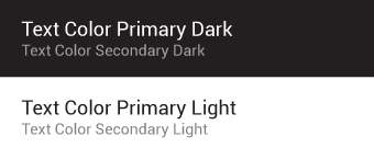
The Android UI uses the following default color styles:textColorPrimary and
textColorSecondary. For light themes use textColorPrimaryInverse and
textColorSecondaryInverse. The framework text color styles also support variants for
touch feedback states when used inside UI elements.
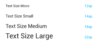
Typographic Scale
Contrast in type sizes can go a long way to create ordered, understandable layouts. However, too many different sizes in the same UI can be messy. The Android framework uses the following limited set of type sizes:
Users can select a system-wide scaling factor for text in the Settings app. In order to support
these accessibility features, type should be specified in scale-independent pixels
(sp)
wherever possible. Layouts supporting scalable types should be tested against these settings.6. Color
Use color primarily for emphasis. Choose colors that fit with your brand and provide good contrast
between visual components. Note that red and green may be indistinguishable to color-blind users.
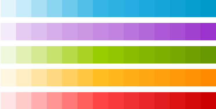
Blue is the standard accent color in Android's color palette. Each color has a corresponding darker shade that can be used as a complement when needed.
Download the swatches
Palette
Blue is the standard accent color in Android's color palette. Each color has a corresponding darker shade that can be used as a complement when needed.
Download the swatches
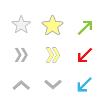
7. Iconography
An icon is a graphic that takes up a small portion of screen real estate and provides a quick,
intuitive representation of an action, a status, or an app.When you design icons for your app, it's important to keep in mind that your app may be installed on a variety of devices that offer a range of pixel densities, as mentioned in Devices and Displays. But you can make your icons look great on all devices by providing each icon in multiple sizes. When your app runs, Android checks the characteristics of the device screen and loads the appropriate density-specific assets for your app.
Because you will deliver each icon in multiple sizes to support different densities, the design guidelines below refer to the icon dimensions in dp units, which are based on the pixel dimensions of a medium-density (MDPI) screen.
So, to create an icon for different densities, you should follow the 2:3:4:6 scaling
ratio between the four primary densities (medium, high, x-high, and xx-high,
respectively). For example, consider that the size for a launcher icon is specified to be
48x48 dp. This means the baseline (MDPI) asset is 48x48 px, and the
high density (HDPI) asset should be 1.5x the baseline at 72x72 px, and the x-high
density (XHDPI) asset should be 2x the baseline at 96x96 px, and so on.
Note: Android also supports low-density (LDPI) screens,
but you normally don't need to create custom assets at this size because Android
effectively down-scales your HDPI assets by 1/2 to match the expected size.
Launcher
The launcher icon is the visual representation of your app on the Home or All Apps screen. Since the user can change the Home screen's wallpaper, make sure that your launcher icon is clearly visible on any type of background.
Sizes & scale
Proportions
Style
Use a distinct silhouette. Three-dimensional, front view, with a slight perspective as if viewed from above, so that users perceive some depth.
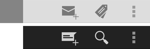
Action Bar
Action bar icons are graphic buttons that represent the most important actions people can take within your app. Each one should employ a simple metaphor representing a single concept that most people can grasp at a glance.
Pre-defined glyphs should be used for certain common actions such as "refresh" and "share." The download link below provides a package with icons that are scaled for various screen densities and are suitable for use with the Holo Light and Holo Dark themes. The package also includes unstyled icons that you can modify to match your theme, in addition to Adobe® Illustrator® source files for further customization.
Download the Action Bar Icon Pack
Sizes & scale
Focal area & proportions
Style
Pictographic, flat, not too detailed, with smooth curves or sharp shapes. If the graphic is thin, rotate it 45° left or right to fill the focal space. The thickness of the strokes and negative spaces should be a minimum of 2 dp.Colors
Colors: #333333Enabled: 60% opacity
Disabled: 30% opacity
Enabled: 80% opacity
Disabled: 30% opacity
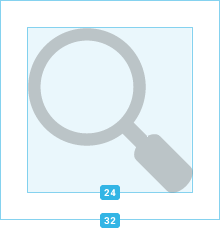
Small / Contextual Icons
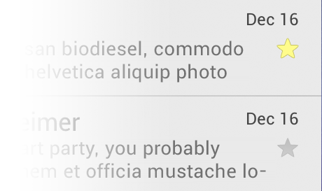
Within the body of your app, use small icons to surface actions and/or provide status for specific items. For example, in the Gmail app, each message has a star icon that marks the message as important.
Sizes & scale
Focal area & proportions
Style
Neutral, flat, and simple. Filled shapes are easier to see than thin strokes. Use a single visual metaphor so that a user can easily recognize and understand its purpose.
Colors
Use non-neutral colors sparingly and with purpose. For example, Gmail uses yellow in the star icon to indicate a bookmarked message. If an icon is actionable, choose a color that contrasts well with the background.
Notification Icons
If your app generates notifications, provide an icon that the system can display in the status bar whenever a new notification is available.
Sizes & scale
Focal area & proportions
Style
Keep the style flat and simple, using the same single, visual metaphor as your launcher icon.Colors
Notification icons must be entirely white. Also, the system may scale down and/or darken the icons.
Design Tips
Here are some tips you might find useful as you create icons or other drawable assets for your application. These tips assume you are using Adobe® Photoshop® or a similar raster and vector image-editing program.
Use vector shapes where possible
Many image-editing programs such as Adobe® Photoshop® allow you to use a combination of vector shapes and raster layers and effects. When possible, use vector shapes so that if the need arises, assets can be scaled up without loss of detail and edge crispness.Using vectors also makes it easy to align edges and corners to pixel boundaries at smaller resolutions.
Start with large artboards
Because you will need to create assets for different screen densities, it is best to start your icon designs on large artboards with dimensions that are multiples of the target icon sizes. For example, launcher icons are 48, 72, 96, or 144 pixels wide, depending on screen density (mdpi, hdpi, xhdpi, and xxhdpi, respectively). If you initially draw launcher icons on an 864x864 artboard, it will be easier and cleaner to adjust the icons when you scale the artboard down to the target sizes for final asset creation.When scaling, redraw bitmap layers as needed
If you scaled an image up from a bitmap layer, rather than from a vector layer, those layers will need to be redrawn manually to appear crisp at higher densities. For example if a 60x60 circle was painted as a bitmap for mdpi it will need to be repainted as a 90x90 circle for hdpi.Use common naming conventions for icon assets
Try to name files so that related assets will group together inside a directory when they are sorted alphabetically. In particular, it helps to use a common prefix for each icon type. For example:| Asset Type | Prefix | Example |
|---|---|---|
| Icons | ic_ |
ic_star.png |
| Launcher icons | ic_launcher |
ic_launcher_calendar.png |
| Menu icons and Action Bar icons | ic_menu |
ic_menu_archive.png |
| Status bar icons | ic_stat_notify |
ic_stat_notify_msg.png |
| Tab icons | ic_tab |
ic_tab_recent.png |
| Dialog icons | ic_dialog |
ic_dialog_info.png |
Set up a working space that organizes files by density
Supporting multiple screen densities means you must create multiple versions of the same icon. To help keep the multiple copies of files safe and easier to find, we recommend creating a directory structure in your working space that organizes asset files based on the target density. For example:art/... mdpi/... _pre_production/... working_file.psd finished_asset.png hdpi/... _pre_production/... working_file.psd finished_asset.png xhdpi/... _pre_production/... working_file.psd finished_asset.pngxxhdpi/... _pre_production/... working_file.psd finished_asset.png Because the structure in your working space is similar to that of the application, you can quickly determine which assets should be copied to each resources directory. Separating assets by density also helps you detect any variances in filenames across densities, which is important because corresponding assets for different densities must share the same filename.
For comparison, here's the resources directory structure of a typical application:
res/...
    drawable-ldpi/...
        finished_asset.png
    drawable-mdpi/...
        finished_asset.png
    drawable-hdpi/...
        finished_asset.png
    drawable-xhdpi/...
        finished_asset.png
Remove unnecessary metadata from final assets
Although the Android SDK tools will automatically compress PNGs when packaging application resources into the application binary, a good practice is to remove unnecessary headers and metadata from your PNG assets. Tools such as OptiPNG or Pngcrush can ensure that this metadata is removed and that your image asset file sizes are optimized.8. Writing
When choosing words for your app:
-
Keep it brief. Be concise, simple and precise. Start with a 30 character limit (including
spaces), and don't use more unless absolutely necessary.
-
Keep it simple. Pretend you're speaking to someone who's smart and competent, but doesn't
know technical jargon and may not speak English very well. Use short words, active verbs, and
common nouns.
-
Be friendly. Use contractions. Talk directly to the reader using second person ("you"). If
your text doesn't read the way you'd say it in casual conversation, it's probably not the way
you should write it. Don't be abrupt or annoying and make the user feel safe, happy and
energized.
-
Put the most important thing first. The first two words (around 11 characters, including
spaces) should include at least a taste of the most important information in the string. If they
don't, start over.
-
Describe only what's necessary, and no more. Don't try to explain subtle differences. They
will be lost on most users.
-
Avoid repetition. If a significant term gets repeated within a screen or block of text, find
a way to use it just once.
Examples
- Keep it brief. From the setup wizard:
Too formal
Consult the documentation that came with your phone for further instructions.
Better
Read the instructions that came with your phone.
- Keep it simple. From the Location settings screen:
Confusing
Use GPS satellites
When locating, accurate to street level.
Better
GPS
Let apps use satellites to pinpoint your location.
- Be friendly. Dialog that appears when an application
crashes:
Confusing and annoying—"Sorry" just rubs salt in the
wound.
Sorry!
Activity MyAppActivity (in application MyApp)
is not responding.
Force close
Wait
Report
Shorter, more direct, no faux-apologetic title:
MyApp isn't responding.
Do you want to close it?
Wait
Report
Close
- Put the most important thing first.
Top news last
77 other people +1'd this, including Larry Page.
Top news first
Larry Page and 77 others +1'd this.
Task last
Touch Next to complete setup using a Wi-Fi connection.
Task first
To finish setup using Wi-Fi, touch Next.
- Describe only what's necessary, and no more.
From a Setup Wizard screen
Signing in...
Your phone needs to communicate with
Google servers to sign in to your account.
This may take up to five minutes.
From a Setup Wizard screen
Signing in...
Your phone is contacting Google.
This can take up to 5 minutes.
Too formal
| Consult the documentation that came with your phone for further instructions. |
Better
| Read the instructions that came with your phone. |
Confusing
| Use GPS satellites |
|---|
| When locating, accurate to street level. |
Better
| GPS |
|---|
| Let apps use satellites to pinpoint your location. |
Confusing and annoying—"Sorry" just rubs salt in the
wound.
| Sorry! | ||
|---|---|---|
| Activity MyAppActivity (in application MyApp) is not responding. | ||
| Force close | Wait | Report |
Shorter, more direct, no faux-apologetic title:
| MyApp isn't responding. | ||
|---|---|---|
| Do you want to close it? | ||
| Wait | Report | Close |
Top news last
| 77 other people +1'd this, including Larry Page. |
Top news first
| Larry Page and 77 others +1'd this. |
Task last
| Touch Next to complete setup using a Wi-Fi connection. |
Task first
| To finish setup using Wi-Fi, touch Next. |
From a Setup Wizard screen
| Signing in... |
|---|
| Your phone needs to communicate with Google servers to sign in to your account. This may take up to five minutes. |
From a Setup Wizard screen
| Signing in... |
|---|
| Your phone is contacting Google. This can take up to 5 minutes. |
No comments:
Post a Comment