Suhan Gorya:
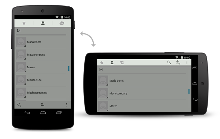
Fixed tabs display all items concurrently. To navigate to a different view, touch the tab, or swipe left or right.
Fixed tabs are displayed with equal width, based on the width of the widest tab label. If there is insufficient room to display all tabs, the tab labels themselves will be scrollable. For this reason, fixed tabs are best suited for displaying 3 or fewer tabs.

If view navigation is essential to your app, you can break out tabs into a separate action bar. This permits fast view switching even on narrower screens.
 Grid lists are an alternative to standard list views. They are best suited for showing data sets
that represent themselves through images. In contrast to simple lists, grid lists may scroll either
vertically or horizontally.
Grid lists are an alternative to standard list views. They are best suited for showing data sets
that represent themselves through images. In contrast to simple lists, grid lists may scroll either
vertically or horizontally.
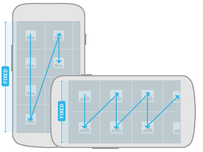
The items in a grid list are arranged in two dimensions, one of which is fixed when scrolling content. The scrolling direction dictates the ordering of the items within the grid list. Since the scrolling direction is not deterministic, make it easy for the user to determine the orientation by cutting off grid items to communicate where the overflow is located.
Avoid creating grid lists that scroll in two dimensions.
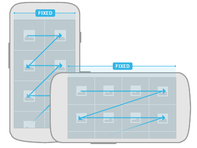
Don't use scrolling tabs as a means to switch views in conjunction with horizontally scrolling grid lists, because the horizontal gesture for view and content navigation will conflict. If you show scrolling tabs for view navigation together with a grid list, use vertical grid scrolling for list navigation.
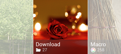
Use labels to display additional contextual information for your grid list items.
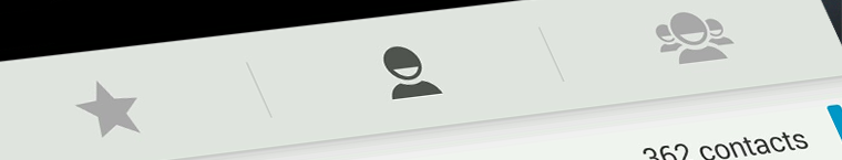
1. Tabs
Tabs in the action bar make it easy to explore and switch between different views or functional
aspects of your app, or to browse categorized data sets.
For details on using gestures to move between tabs, see the Swipe Views pattern.
Scrollable Tabs
Scrolling tab controls can contain a larger number of items than a standard tab control. To navigate
to the next/previous view, swipe left or right.
Scrolling tabs in the Play Store app.
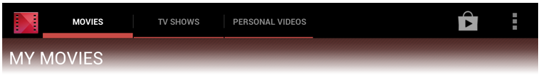
Fixed Tabs
Fixed tabs display all items concurrently. To navigate to a different view, touch the tab, or swipe left or right.
Fixed tabs are displayed with equal width, based on the width of the widest tab label. If there is insufficient room to display all tabs, the tab labels themselves will be scrollable. For this reason, fixed tabs are best suited for displaying 3 or fewer tabs.
Tabs in Holo Dark & Light.
Tabs in the Google Play Movies app.
Stacked Tabs
If view navigation is essential to your app, you can break out tabs into a separate action bar. This permits fast view switching even on narrower screens.
List View
Lists present multiple line items in a vertical arrangement. They can be used for data selection as
well as drilldown navigation.
-
Section Divider
Use section dividers to organize the content of your list into groups and facilitate scanning.
-
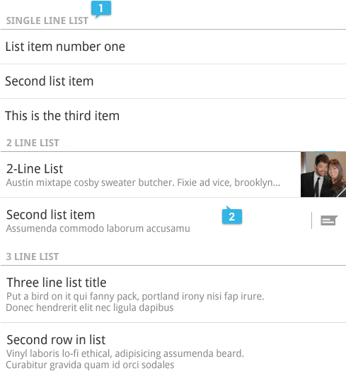
Line Items
List items can accommodate a wide range of data types in different arrangements, including simple single-line items, multi-line items, and custom items with icons, checkboxes, and action buttons.
Grid Lists
Grid View
Generic Grids
The items in a grid list are arranged in two dimensions, one of which is fixed when scrolling content. The scrolling direction dictates the ordering of the items within the grid list. Since the scrolling direction is not deterministic, make it easy for the user to determine the orientation by cutting off grid items to communicate where the overflow is located.
Avoid creating grid lists that scroll in two dimensions.
Vertical scrolling
Vertically scrolling grid list items are sorted in traditional western reading direction: left-to-right and top-down. When displaying the list, cut off the items in the bottom row to communicate that the user can scroll the list down to show additional items. Be sure to retain this scheme when the user rotates the screen.
Horizontal scrolling
Horizontally scrolling lists fix the vertical axis of the item grid. Compared to vertically scrolling lists, the sorting changes slightly to a top-down and left-to-right arrangement. Employ the same technique of cutting off the items in the rightmost column to indicate the scrolling direction.Don't use scrolling tabs as a means to switch views in conjunction with horizontally scrolling grid lists, because the horizontal gesture for view and content navigation will conflict. If you show scrolling tabs for view navigation together with a grid list, use vertical grid scrolling for list navigation.
Grid List with Labels
Use labels to display additional contextual information for your grid list items.
Style
Use semi-transparent panels on top of the grid list items to display your labels. This allows you to control the contrast and ensures legibility of the labels while letting the content "shine through".4. Scrolling
Scrolling allows the user to navigate to content in the overflow using a swipe gesture. The
scrolling speed is proportional to the speed of the gesture.
Appears during scrolling to indicate what portion of the content is currently in view.
In addition to traditional scrolling, a long alphabetical list can also offer index scrolling: a way to quickly navigate to the items that begin with a particular letter. With index scrolling, a scroll indicator appears even when the user isn't scrolling. Touching or dragging it causes the current letter to pop up in a prominent way.
Scroll Indicator
Appears during scrolling to indicate what portion of the content is currently in view.
Index Scrolling
In addition to traditional scrolling, a long alphabetical list can also offer index scrolling: a way to quickly navigate to the items that begin with a particular letter. With index scrolling, a scroll indicator appears even when the user isn't scrolling. Touching or dragging it causes the current letter to pop up in a prominent way.
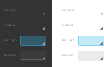
Spinners
Spinners provide a quick way to select one value from a set. In the default state, a spinner shows
its currently selected value. Touching the spinner displays a dropdown menu with all other available
values, from which the user can select a new one.
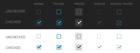
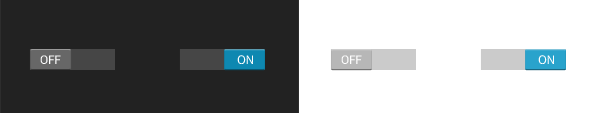
Checkboxes allow the user to select multiple options from a set. Avoid using a single checkbox to
turn an option off or on. Instead, use an on/off switch.
Radio buttons allow the user to select one option from a set. Use radio buttons for exclusive
selection if you think that the user needs to see all available options side-by-side. Otherwise,
consider a spinner, which uses less space.
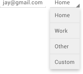
Spinners in forms
Spinners are useful for data picking in forms. They are compact and integrate nicely with other components. Use spinners in forms for both simple data input and in combination with other input fields. For example, a text field might let you edit an email address for a contact, while its associated spinner allows you to select whether it's a Home or Work address.
Spinners in action bars
Use spinners in action bars to switch views. For example, Gmail uses a spinner to permit switching between accounts or commonly used labels. Spinners are useful when changing the view is important to your app, but not necessarily a frequent occurrence. In cases where view switching is frequent, use tabs.
Spinners in the Holo Dark and Holo Light themes, in various states.
Buttons
A button consists of text and/or an image that clearly communicates what action will occur when the
user touches it. Android supports two different types of buttons: basic buttons and borderless
buttons. Both can contain text labels and/or images.
Basic buttons are traditional buttons with borders and background. Android supports two styles for basic buttons: default and small. Default buttons have slightly larger font size and are optimized for display outside of form content. Small buttons are intended for display alongside other content. They have a smaller font and smaller minimum height. Use small buttons in forms where they need to align with other UI elements.
Borderless buttons resemble basic buttons except that they have no borders or background. You can use borderless buttons with both icons and text. Borderless buttons are visually more lightweight than basic buttons and integrate nicely with other content.
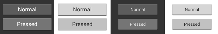
Basic Buttons
Basic buttons are traditional buttons with borders and background. Android supports two styles for basic buttons: default and small. Default buttons have slightly larger font size and are optimized for display outside of form content. Small buttons are intended for display alongside other content. They have a smaller font and smaller minimum height. Use small buttons in forms where they need to align with other UI elements.
Default buttons in Holo Dark & Light.
Small buttons in Holo Dark & Light.
Borderless Buttons
Borderless buttons resemble basic buttons except that they have no borders or background. You can use borderless buttons with both icons and text. Borderless buttons are visually more lightweight than basic buttons and integrate nicely with other content.
7. Text Fields
Text Fields
Text fields allow the user to type text into your app. They can be either single line or multi-line.
Touching a text field places the cursor and automatically displays the keyboard. In addition to
typing, text fields allow for a variety of other activities, such as text selection (cut, copy,
paste) and data lookup via auto-completion.

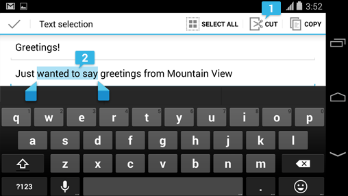
Users can select any word in a text field with a long press. This action triggers a text selection mode that facilitates extending the selection or choosing an action to perform on the selected text. Selection mode includes:
Single line and multi line
Single-line fields automatically scroll their content to the left as the text input cursor reaches the right edge of the input field. Multi-line text fields automatically break to a new line for overflow text and scroll vertically when the cursor reaches the lower edge.
Text field types
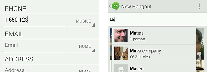
Text fields can have different types, such as number, message, or email address. The type determines what kind of characters are allowed inside the field, and may prompt the virtual keyboard to optimize its layout for frequently used characters.Auto-complete text fields
Use auto-complete text fields to present real-time completions or search results in popups, so users can enter information more accurately and efficiently.Text Selection
Users can select any word in a text field with a long press. This action triggers a text selection mode that facilitates extending the selection or choosing an action to perform on the selected text. Selection mode includes:
-
Contextual action bar
A contextual action bar (CAB) displays the actions available to perform on the selection: typically cut, copy, and paste, but apps can insert additional commands as needed.
-
Selection handles
Selection handles can be dragged to select more or less text while remaining in selection mode.
8. Seek Bars and Sliders
Interactive sliders make it possible to select a value from a continuous or discrete range of values
by moving the slider thumb. The smallest value is to the left, the largest to the right. The
interactive nature of the slider makes it a great choice for settings that reflect intensity levels,
such as volume, brightness, or color saturation.
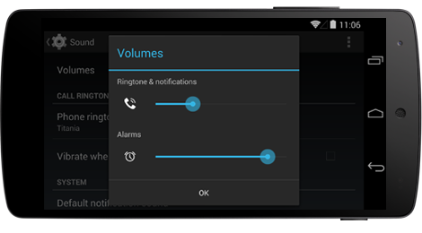
Example
Interactive slider to set the ringer volume. The value can either be set through the hardware volume controls or interactively via a gesture.
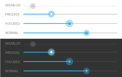
Seek bars in Holo Light & Dark
9. Progress & Activity
Progress bars and activity indicators signal to users that something is happening that will take a moment.
Progress bars are for situations where the percentage completed can be determined. They give users a quick sense of how much longer an operation will take.
 A progress bar should always fill from 0% to 100% and never move
backwards to a lower value. If multiple operations are happening in
sequence, use the progress bar to represent the delay as a whole, so
that when the bar reaches 100%, it doesn't return back to 0%.
A progress bar should always fill from 0% to 100% and never move
backwards to a lower value. If multiple operations are happening in
sequence, use the progress bar to represent the delay as a whole, so
that when the bar reaches 100%, it doesn't return back to 0%.
Activity indicators are for operations of an indeterminate length. They ask users to wait a moment while something finishes up, without getting into specifics about what's happening behind the scenes.
Two styles are available: a bar and a circle. Each is offered in a variety of sizes, in both Holo Light and Holo Dark themes. Choose the appropriate style and size for the surrounding context. For example, the largest activity circle works well when displayed in a blank content area, but not in a smaller dialog box. Each operation should only be represented by one activity indicator.
The standard progress bar and activity indicators work well for most situations and should be used whenever possible to provide a consistent experience across Android. However, some situations may call for something more custom.
Here's an example:
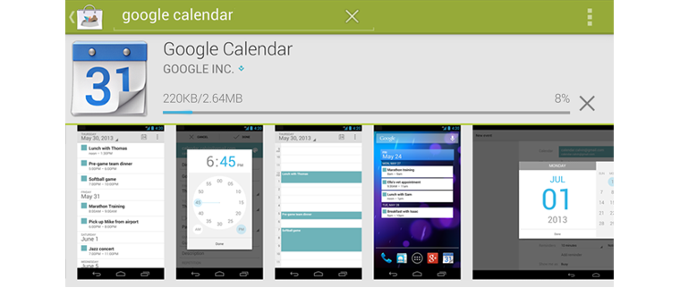
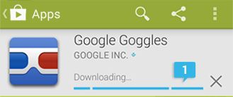
In all of the Google Play apps (Music, Books, Movies, Magazines), we wanted the current download state of each item to be visible at all times at the top-level screen. These states are:
We also needed to indicate progress from one download state to another, because downloading is not instantaneous.
This presented a challenge, because the Google Play apps use a variety of different layouts, and some of them are highly space-constrained. We didn't want this information to clutter the top-level screens, or compete too much with the cover art.
So we designed a custom indicator that could show all of the information in a tiny footprint, with the flexibility to appear on top of content if necessary.
 The color indicates whether it's downloaded (blue) or not (gray). The
appearance of the pin indicates whether the download is permanent
(white, upright) or temporary (gray, diagonal). And when state is in the
process of changing, progress is indicated by a moving pie chart.
The color indicates whether it's downloaded (blue) or not (gray). The
appearance of the pin indicates whether the download is permanent
(white, upright) or temporary (gray, diagonal). And when state is in the
process of changing, progress is indicated by a moving pie chart.
 If you find that the standard indicators aren't meeting your needs
(due to space constraints, state complexities), by all means design your
own. Make it feel like part of the Android family by injecting some of
the visual characteristics of the standard indicators. In this example,
we carried over the circular shape, the same shade of blue, and the flat
and simple style.
If you find that the standard indicators aren't meeting your needs
(due to space constraints, state complexities), by all means design your
own. Make it feel like part of the Android family by injecting some of
the visual characteristics of the standard indicators. In this example,
we carried over the circular shape, the same shade of blue, and the flat
and simple style.
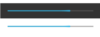
Progress bars
Progress bars are for situations where the percentage completed can be determined. They give users a quick sense of how much longer an operation will take.
A progress bar should always fill from 0% to 100% and never move
backwards to a lower value. If multiple operations are happening in
sequence, use the progress bar to represent the delay as a whole, so
that when the bar reaches 100%, it doesn't return back to 0%.
Progress bar in Holo Dark and Holo Light.
Activity indicators
Activity indicators are for operations of an indeterminate length. They ask users to wait a moment while something finishes up, without getting into specifics about what's happening behind the scenes.
Two styles are available: a bar and a circle. Each is offered in a variety of sizes, in both Holo Light and Holo Dark themes. Choose the appropriate style and size for the surrounding context. For example, the largest activity circle works well when displayed in a blank content area, but not in a smaller dialog box. Each operation should only be represented by one activity indicator.
Activity bar
In this example, an activity bar (in Holo Dark) appears when a user first requests a download. There's an unknown period of time when the download has not yet started. As soon as the download starts, this activity bar transforms into a progress bar.
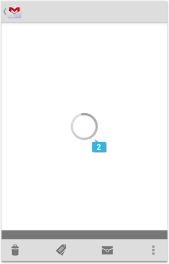
Activity circle
In this example, an activity circle (in Holo Light) is used in the Gmail application when a message is being loaded because it's not possible to determine how long it will take to download the email.
When displaying an activity circle, do not include text to communicate what the app is doing. The moving circle alone provides sufficient feedback about the delay, and does so in an understated way that minimizes the impact.
Don't Do
Do
Custom indicators
The standard progress bar and activity indicators work well for most situations and should be used whenever possible to provide a consistent experience across Android. However, some situations may call for something more custom.
Here's an example:
In all of the Google Play apps (Music, Books, Movies, Magazines), we wanted the current download state of each item to be visible at all times at the top-level screen. These states are:
- Not downloaded
- Temporarily downloaded (automatically cached by the app)
- Permanently downloaded on the device at the user's request
We also needed to indicate progress from one download state to another, because downloading is not instantaneous.
This presented a challenge, because the Google Play apps use a variety of different layouts, and some of them are highly space-constrained. We didn't want this information to clutter the top-level screens, or compete too much with the cover art.
So we designed a custom indicator that could show all of the information in a tiny footprint, with the flexibility to appear on top of content if necessary.
The color indicates whether it's downloaded (blue) or not (gray). The
appearance of the pin indicates whether the download is permanent
(white, upright) or temporary (gray, diagonal). And when state is in the
process of changing, progress is indicated by a moving pie chart.
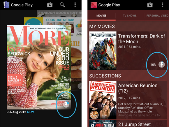
Across Google Play apps with different layouts, the same custom
indicator appears with each item. It communicates download state as well
as progress, in a compact package that can be incorporated into any
screen design.
10. Switches
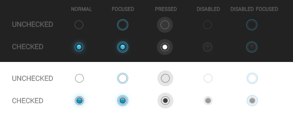
Switches allow the user to select options. There are three kinds of switches: checkboxes, radio
buttons, and on/off switches.
Checkboxes
Checkboxes
Radio Buttons
Radio Buttons
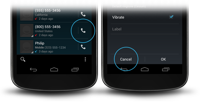
Dialogs
Dialogs prompt the user for decisions or additional information required by the app to continue a
task. Such requests can range from simple Cancel/OK decisions to more complex layouts asking the
user to adjust settings or enter text.
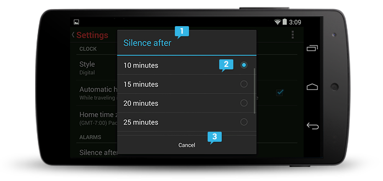
Alerts inform the user about a situation that requires their confirmation or acknowledgement before proceeding. They differ slightly in appearance based upon the severity and impact of the message conveyed.
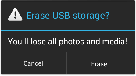
Keep the question or statement short: for example, "Erase USB storage?" Avoid apologies. A user should be able to skip the content completely and still have a clear idea of what choices are available based on the title and the text of the action buttons.
When crafting a confirmation dialog, make the title meaningful by echoing the requested action.
Popups are lightweight version of dialogs that require a single selection from the user. Popups don't have have explicit buttons that accept or cancel the operation. Instead, making a selection advances the workflow, and simply touching outside the popup dismisses it.
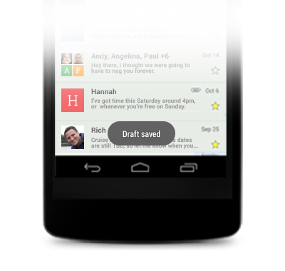
Toasts provide lightweight feedback about an operation in a small popup. For example, navigating
away from an email before you send it triggers a "Draft saved" toast to let you know that you can
continue editing later. Toasts automatically disappear after a timeout.
-
Optional title region
The title introduces the content of your dialog. It can, for example, identify the name of a setting that the user is about to change, or request a decision.
-
Content area
Dialog content varies widely. For settings dialogs, a dialog may contain UI elements such as sliders, text fields, checkboxes, or radio buttons that allow the user to change app or system settings. In other cases, such as alerts, the content may consist solely of text that provides further context for a user decision.
-
Action buttons
Action buttons are typically Cancel and/or OK, with OK indicating the preferred or most likely action. However, if the options consist of specific actions such as Close or Wait rather than a confirmation or cancellation of the action described in the content, then all the buttons should be active verbs. Order actions following these rules:
- The dismissive action of a dialog is always on the left. Dismissive actions return to the user to the previous state.
- The affirmative actions are on the right. Affirmative actions continue progress toward the user goal that triggered the dialog.
Samples of typical dialog use in Android.
Alerts
Alerts inform the user about a situation that requires their confirmation or acknowledgement before proceeding. They differ slightly in appearance based upon the severity and impact of the message conveyed.
Alerts without title bars
Most alerts don't need titles. Usually the decision doesn't have a severe impact and can be summed up succinctly in a sentence or two. The content area should either ask a question (such as "Delete this conversation?") or make a clear statement whose relationship to the action buttons is obvious.
Alerts with title bars
Use alerts with title bars sparingly. They are appropriate only when a high-risk operation involving potential loss of data, connectivity, extra charges, and so on requires a clear question or statement (the title) and some additional explanation (in the content area).Keep the question or statement short: for example, "Erase USB storage?" Avoid apologies. A user should be able to skip the content completely and still have a clear idea of what choices are available based on the title and the text of the action buttons.
Don't
| Are you sure? |
|---|
Don't
| Warning! |
|---|
Do
| Erase USB storage? |
|---|
Popups
Popups are lightweight version of dialogs that require a single selection from the user. Popups don't have have explicit buttons that accept or cancel the operation. Instead, making a selection advances the workflow, and simply touching outside the popup dismisses it.
Toasts
Toasts
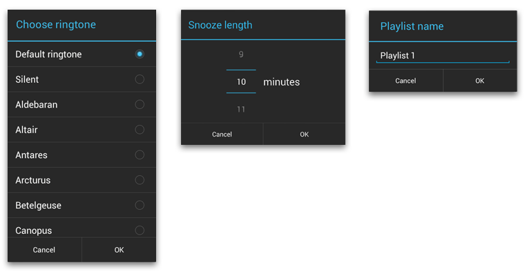
Pickers
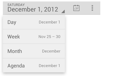
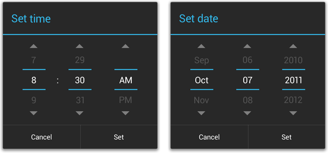
Pickers provide a simple way to select a single value from a set. In addition to touching the
up/down arrow buttons, it's possible to set the desired value from the keyboard or via a swipe
gesture.
Android provides these as ready-to-use dialogs. Each picker is a dialog with a set of controls for entering the parts of the date (month, day, year) or time (hour, minute, AM/PM). Using these in your app helps ensure that a user's specification of a data or time input is valid and formatted correctly. The format of a time and date picker adjusts automatically to the locale.
Space considerations
Pickers can be used inline on a form, but their relatively large footprint is best suited for display in a dialog. For inline display, consider using more compact controls such as text fields or spinners.Date and time pickers
Android provides these as ready-to-use dialogs. Each picker is a dialog with a set of controls for entering the parts of the date (month, day, year) or time (hour, minute, AM/PM). Using these in your app helps ensure that a user's specification of a data or time input is valid and formatted correctly. The format of a time and date picker adjusts automatically to the locale.
No comments:
Post a Comment